A Boy and His Bike

A Boy and His Bike

I was feeling pretty inspired after that last post, so I made a new illustrated-photography piece. Pretty rare for me to do self-portraits, and even rarer to do two in a row, but this one is special in a couple ways. First, it’s me, way back when I was seven or eight, at Christmas, receiving my first bicycle. I was playing it cool for the camera, but I was totally stoked! This is also unique in that it’s the first illustrated-photo where I’ve used a photo taken by someone else, in this case, my mom. (Thanks mom!) It was really neat to work on this, because it felt like time traveling 30 years back in time. I still remember that day clearly. That gleaming blue and silver bike. That Garfield reflector. It being a frigid Michigan winter day, but me riding the heck out of my new wheels. Sadly, that bike got hacked up in high school by a friend who wanted to experiment with BMX customization (and he kind of mangled it in the process). I gave it, in its current form, to another friend of mine last year, so he could use it for something. I trust him to put it to better use, and even though I have fond feelings for it, it’s not that usable in its current state, thanks to high school dude. After doing this piece, I feel a bit wistful, and miss the bike. I can’t use it myself, obviously, but now that my wife and I are thinking of expanding our family to three in the future, it would be neat to see if it could be fixed up and given to future kid someday. Oh well, you can’t go backwards…


Fun fact, this is my 50th illustrated-photo done on computer, and 76th overall. The first one I’ve done with the combination of CG/Wacom and film photo, and (as mentioned) the first one done using someone else’s photo. Here’s to another 50!

Lantern

Lantern

I moved to Nagasaki Japan in January 2013, and as I type this at the end of 2018, my chapter here will likely soon be coming to an end. If all goes according to plan with immigration, my wife Miwa and I will be living in my home state of Michigan soon. All these years in this lovely Kyushu city have fundamentally changed me. No matter where I go, I feel that the experiences I’ve had here have made me look at the world differently and helped me to better shed some of my own cultural baggage and biases. Living abroad has helped me to feel stateless, in a good way. The distance I’ve had from my home country has made me feel more distant from it in some ways, and other experiences have brought my heart closer. My time in Japan has etched a part of that culture into my heart, while some experiences have reminded me how foreign I am in this archipelago. If it makes any sense, it’s brought me closer to myself as an internationally-minded person.


My previous illustrated-photography piece, Tatemae, dealt with the “masks” that we all wear when interfacing with the world. This deals with some of what’s behind my mask, and one of the things that will forever be a part of me is Nagasaki.


I made this work to be an album cover for a hopefully-upcoming album of my music. I’m way out of practice with making music, and despite my rabid desire to get back into it, and my wealth of ideas, I am always too busy with work to really get down to it. I finished this art seven months ago, and rather than let this artwork wither away without anyone seeing it, I’m posting it now, in hopes that I will get that album done later when there’s time.


While it may look like a simple wireframe, the image of my inner-self is that of an illuminated paper lantern, modeled after the giant, beautiful lanterns on display every February in Nagasaki’s Lantern Festival. The eyes, contain pentacles, which may look vaguely occult to some folks, but it’s actually the logo from the flag of Nagasaki, and can be found on official documents, and almost every manhole in the city!


Click the image above, or here, to see the gallery page for this, with details of the artwork.


Bonus! For the first time in several years, I made a “making-of” page for one of my works. If you want to read an in-depth guide to the (admittedly fraught) process of making “Lantern”, and find out more about the cultural meaning behind it, please click here or the banner below!


the making of

“Cacciatore” – remastered

Cacciatore

I revisited an old friend. Since I’d lost the original files for most of my circa 2007, 2008 work, I’ve gradually been remaking some of them here and there, remastered and able to be printed huge. In 2012, I redid my old favorite Automaton JDM. This time I decided to revisit “Cacciatore”, which I not only no longer could make big prints of, but always felt a little bit conflicted as to how the final product turned out. Here’s the original:


Cacciatore - original

I liked the general elements of the piece, but was always a little unhappy with the size and placement of the guy (my old roommate Patric) with the background, and was planning on fixing that before, when I had the original layered file. Also, while the whole splattered blood thing seemed pretty cool to me at the time, and I was going for a bit of a giallo Italian horror / crime movie vibe, over time I felt a little weird about it. Maybe it’s the fact that I’ve become more and more anti-gun over time… I realized a lot of my old pieces had guns in them, and I’ve been trying to steer away from that in recent years. This new version still has the gleaming golden gun, but I opted to tone down the general violent feel a bit. Maybe I’m just becoming an old softy.


For this new version, I scanned the 8×10 print I’d made for the original, and used that as a a base at first (for the outlines on Patric’s suit), then used the original two photographs (Patric, and the Alfa Romeo & spokesmodel) as a base and ended up redrawing the whole thing, adding new textures and changing things such as the highlights and shading of the car, as well as including the girl’s arms and showing the dash lit up. I thought about maybe having the woman more visible, as I went to the trouble of redrawing the whole background, even the stuff that can’t be seen in the final product…. but opted not to. The thing is, I took the photo of this spokesmodel and the Alfa Romeo Brera at the 2007 Tokyo Motor Show, when I was there doing freelance work for Intersection. Since it was press day and she was paid to be there to be in published photos, it’s fine for me to show her face in the Motor Show pics I have online, but I felt a little odd about having her face in the final artwork that I’m displaying online, since it’s unrelated to the original reason she was there. Plus, I think leaving the pic as it is maintains the mystery of the original piece.


Anyway, it was a fun project. Even though I have it further back in the gallery, with the other 2007 stuff, it’s basically a new illustrated-photography work from me. I’ve been in the mood to make a lot more, after taking a few years off from working in that style. I have some ideas that I want to get done, when I have time. Problem is, my manga work keeps me busy enough it’s hard to find time to work on my own stuff. Hopefully I can get another new piece done in December, since things will be mellowing out for a couple weeks mid-late month. I’m also still really wishing I could find models to work with here, but it’s hard in Nagasaki, where it’s a bit more conservative and a lot of people are shy. I’ve been really missing setting up big shoots with models, props, makeup, and wardrobe, and then making crazy illustrated-photography pieces from them. I may at least revisit some old photoshoots and make illustrated photography from them in the meantime, just to cast a new light on things. Anyway, stay tuned!

“Silence is Golden” – revisited

Silence is Golden - new art

Recently, I made a box set of my music for my friend Ethan, before he moved to Tokyo. For each of the six included albums, I redesigned the packaging and added some new art.I’ll make a post about more of that later, but to start, I wanted to share with you the two new illustrated photography pieces I made this summer for “Silence is Golden”, my 2006 LP. In addition to the original cover and back cover, I used two more photos from my shoot with Dawon to make an inner sleeve to hold the disc, one of which is a track listing. It was fun to revisit this photo shoot and make something new from it. Check out bigger views of this art in the Illustrated Photography section and see the packaging design in the Design section!

Tatemae / 建前

Tatemae

Hey everyone! I’m, uhhhh, not DEAD. I finally made a new illustrated-photography piece. (Well, I made a quick one two years ago in ink over inkjet print, but this is my first digital one since 2013.)


Honne (本音) and tatemae (建前) are Japanese words used to describe the contrast between one’s personal feelings (honne) and the facade that one presents to the world (tatemae). While it certainly depends on the person, in Japan it’s often difficult to get past the wall that people put up and get to know someone’s true feelings. Generally this “wall” is a friendly one, mind you, but sometimes not genuine. I don’t think this is a uniquely Japanese thing, and I think we all conceal parts of our true feelings. I thought I’d explore this idea a bit since I find it both fascinating and frustrating.


One thing I often found unsettling while teaching English in Japan was how many of my students would wear a mask, not just when they were sick, but in general. Some kids wore it every day. Once in a while, during flu season, I’d walk into a jr high classroom and every single kid would be wearing one, and I’d be unable to fully “read” their social cues. I think for most people it’s a matter of stopping germ transfer when a bug is going around, but for the folks who wear them every day, it seems like the tatemae mask takes on a literal form.


Anyway, as usual these days for a lot of my art, you can pop on over to Society6 to order a print of it, or cell phone case, pillows, tote bags, whatevs!


In other news, this has been a crazy busy year so far with manga lettering, but pretty front-loaded. From now on I’ll have a bit more free time here and there to make more art and hopefully music. One of these days, I badly need to update the lettering section of my design page since it only reflects four of the 17 different manga series I’ve lettered, but that’ll have a wait a bit more. Right now, after a nice stay-cation, it’s time to get to work on the next book.


I will say, I got to work on a dream project earlier this year. I got to re-letter Akira for the 35th anniversary boxed set that Kodansha is putting out this fall! It was amazing! I’ve always deeply loved that manga, and it was a huge inspiration on me growing up, and to be able to observe Otomo’s art with the level of intimacy that working with it on my own computer brought, was a truly special experience. More on that later.

VERSION 3.0

evanhaydenart.com version 3.0 is now live!

Hello world!


It’s finally done… After five years I finally gave my art site a complete overhaul and it’s now online. This is my biggest site redesign yet, and I started over from scratch. Here are some of the changes I made:


  • New aesthetic design. The theme could best be described as “rainbow”.  Each gallery section now has its own unique color scheme, for example purple for Illustrated-photography, blue for Photography, and so on. If you’ve been visiting my site for a long time, the background may seem familiar. I always liked the random jaggy thin-line pattern background of the old pre-evanhaydenart.com days, so I brought it back, but in this case, it’s a different color in each gallery. Also making a return is one of my favorite typefaces, Herb Lubalin’s “Avant-Garde”, making up the navigation section lettering. It’s a more sedate usage of the typeface than he did, but I think it works fairly elegantly for the nav boxes. Speaking of typefaces, I stopped using Lubalin Graph (Another Lubalin classic. He was an amazing designer!) since I used it to death on version 2.0’s design. I’ll still use it on blog post promo images, because it is my favorite typeface, but for the main site, I went with something a little more familiar… Georgia! Yep, everyone has this font, and maybe it could seem boring, but I like it a lot, so hey… In other news related to the new design,  all the thumbnail images and text is a little bigger now, to account for larger monitor sizes and resolutions, and to make for easier viewing on mobile devices. Also, the page headers still show a different image upon each page load, but now they’re color-matched to the rest of the page. So many different files were made for that…
  • Flashier index page(s). Speaking of rotating images, the new index splash page is definitely splashy! A new background loads upon each visit to the page, and fills the screen. I’m sort of picky about the new trend of GIANT leader images for articles and whatnot, but I think for a gallery front page it’s fine. I also tried to make this page work a little better on mobile devices.
  • New, wider layout. I ditched the two-column design for a single-column design, allowing me to use bigger images (seems fitting for an art gallery site, right?) The navigation is now at the top of the page, under the header.
  • Big big big! About those big images, I apologize for anyone on slow internet connections, but I decided to go all-out this time… Each gallery page has big 1000px wide images for the artwork, and in the case of some pages where the art is a series of pictures, several of those big images. I feel that for an art portfolio site, big splashy images is good, and enough people have high-speed internet these days that I feel pretty comfortable designing for that now. It might be a headache on mobile networks if you’re at 3G or below, and I know that’s where a lot of people view the internet these days, but I firmly believe an art site is best viewed on a decent sized monitor.
  • Mobile-ish. On the topic of mobile-internet, I haven’t yet figured out how to make a totally mobile-friendly site yet (I’m not a programmer, I just struggle my way through each redesign when I absolutely have to), but even though some of the images are pretty big now (which load just fine on 4G), the layout this time around is at least a bit better for mobile. There’s some text you need to expand to see better, but the site doesn’t totally fall apart when viewed on a cell phone like my old site did. If I had the time, I would make a separate version of the site just for mobile, and have the code redirect you there when you view it on a phone, but I’m way too busy with work right now to do that, so please hang in there until I can 🙂  This site took long enough as is to redesign (a couple hundred hours, easily) so I may have to wait until I can afford to hire a designer to make a more mobile-friendly version for me.
  • my Society6 storeOther changes… I reorganized the site. After seven years apart, the fashion / portrait photography and automotive photography pages have been consolidated back into a Photography page. Since I haven’t been doing many proper shoots of cars lately, that page seems a little flimsy to warrant its own separate gallery. Also, all the separate gallery archive pages have been consolidated into one Archive page. Another change now involves the bio, links, and store pages being consolidated into an About page. I added some stuff to that about page. The resume / biography is still there, as are links. I added a FAQ page, a Contact page, and a proper Store. The FAQ exists to try to handle some of the questions I get repeatedly over the years… the Contact page is pretty self-explanatory, and now doesn’t involve me having to divulge an email address (thanks Foxyform!)
  • Store! Finally! The store is the big addition… After, oh, seven years of promising I’d add a store to my site to make it easier to buy prints, I finally did, with Society6. Part of what caused the delay for so long was my 2008 hard drive failure, which caused me to lose a lot of original art. Once I rebuilt my portfolio and had some good stuff to sell, it was a combination of being busy and being honestly a bit intimidated by the whole thing. Society6 should be a good solution because I don’t have the time right now to print and send orders myself, and doing so from Japan is its own kind of headache. Society6 fulfills the orders for me, and they have a good quality to their work. So yeah, finally, if you want to order prints of my work, or other stuff (pillows, cell phone / ipad cases, laptop skins, leggings, duvet covers, shower curtains, etc!), please check out my store!
  • NSFW-avoidance, if you want it. I separated the NSFW / 18+ only artwork a bit more from the rest of the content. I don’t want to censor myself, but given the nature of my day job, teaching kids, I wanted to make it a little harder to stumble across stuff that might not be suitable for the office or for younger eyes. Now, when you go to certain galleries, such as Illustrated-photography, the subsection with nudity or violent images is clearly labeled as such, in English and Japanese, and separated from the other content. If you’re using the back / forward buttons to navigate from page to page, it will stop when it gets to the NSFW content, sending you back to the main gallery, and you’ll have to click the thumbnail of the NSFW stuff to see it. No passwords or any stupid stuff like that. I just wanted to keep things accessible to those who want to see it, but stuff harder to have an “oopsie” moment and see it when you weren’t expecting it.
  • I mentioned Japanese… One thing I was planning to add to the launch, but decided to wait on a little bit longer, is Japanese translations for a lot of the major content. I already did them, in my mangled Japanese, but I have a friend who’s helping to smooth them out, so I’ll add said translations soon. The site is still prominently English-language, but at least for the main gallery indexes, there will be Japanese as well. For the individual artwork pages, there will be just English, but those are more about the imagery anyway, and I type too much sometimes, so maybe I’m actually sparing my Japanese viewers a bit!
  • New blog. As mentioned in the last blog post, the Blog has been 100% redone. After I bungled things and lost my blog archive, I took the time to redo all the old entries based off of salvaged data from the Internet Archive (but lost the comments, sadly). I also added some “from the future!” content to some of those old entries, ie: photos from events that happened. The new blog works much better on mobile devices. Well, to be honest, I used some WordPress trickery to make the site load a separate version for viewing the blog on a cell phone, and it’s not super pretty, but at least it’s not broken. It’ll do for now, until I can figure out how to customize it to make it have a bit more in common, design-wise, with the desktop site. new art!
  • What else? I added a TON of new artwork to the site… The Illustration gallery now has a section dedicated to educational art, of which I’ve been making a lot at my day job. This section includes an in-depth look at the “Hello English Picture Dictionary”, which is a publication I designed, edited, and illustrated. Also featured are worksheets I’ve made art for, and the “Word-of-the-Week” whiteboard that I draw each week for my students. Go check all that out! The Photography gallery has a new “Etcetera” section now, with photos of cats, birds, urban wreckage, night photography, and other things! Also added to the Photography page is some of the photos I’ve shot over the years of mangled and neglected vehicles and more robot photos! Growing up in the rust belt made for many such opportunities. I added new art to the Illustrated-photography gallery – an ink one, my first such piece like that in eight years. It’s of my lovely girlfriend Miwa. Finally, I added some new stuff to the Design gallery, including more mix CDs with custom packaging, more flyers, and a more depth look at my manga lettering.
  • B-B-B-BONUS. One thing you’ll notice on many of the artwork pages, is a lot more bonus content. More details, more behind-the-scenes, more more more! Also for each artwork that is available to buy on Society6, it’s linked within the page, and for manga and zines, there are links to buy the books from their respective publishers.


Okay, I think that about sums it up! Jeez, sorry to type a novel here, but this is the biggest update ever to my art site and there was a lot to cover! I’ll have more art coming soon, so stay tuned!

Amethyst

Amethyst

Howdy boys and girls! Here’s something I whipped up recently… The release image for my single “Amethyst”. I put it in the Illustrated-Photography gallery, even though it’s about 90% illustration, 10% photography (as opposed the roughly 50/50 split of most of that work) because I thought it fit in better thematically. Not manga-ish like a lot of my pure illustration work is…


I’m sort of fascinated by crystals, in terms of their shapes, and also with polygon graphics and early computer graphics. I decided to put these themes together for the rather surreal lady you see here. If you want to listen to the track that I made this for, check out the video below:


“Automaton JDM” – remastered

Automaton JDM

I’m on a roll right now, in terms of working on creative projects. A little over 24 hours ago, I posted my brand new illustrated-photography piece, and I just finished finished something that is both new and old at the same time.


In 2008, I made “Automaton JDM”, the image you see above. At the time, it was a personal milestone, in terms of detail, concept, and execution, and I think it blew my first Automaton piece (from 2006) out of the water. More recently, you’ve seen the third piece in the Automaton series, from last year, which is even crazier than the 2008 example. Anyway, back to 2008… After making “JDM”, as well as a couple other pieces around that time that I was quite proud of, my hard drive died and I lost the original hi-res / layered files, as well as a ton of other stuff. (PROTIP: Back your stuff up kids!) I was devastated at the time (it still stings a bit to think about), but I plugged on ahead with new work, and rebuilt / salvaged some of my older pieces. Lacking the digital files, I made high-res scans of prints that I’d previously made, redrew things, and tried my best to smooth out the colors and textures. On one particularly challenging salvage, I didn’t even have a print to scan, since I’d made the piece a few days before the crash. All I had was a tiny jpg, and an insanely difficult task of scaling it up to a decent print size, redrawing the whole thing from scratch, and doing a lot of damage control on horribly-enlarged pixels. Despite my best efforts, I was never fully happy with the results of some of these salvaged versions, as they always looked muddy and dark compared to the original digital files, but after the hard drive disaster, I didn’t have much that I could print out for art shows, so I had to make do.


Anyway, I was especially bothered by how much less vibrant Automaton JDM looked after salvaging, compared to its original form. All I had left of the original was a 750px wide jpg (which you’ll see top-right.) I salvaged that one in early 2009, but was never happy with the results. It was too dark and murky (see bottom-right.) It basically did the job for printing, but I felt a pang of guilt selling prints of it, as I knew it was not as good as it originally was, but there was certainly no way I could sell prints of a 750px wide jpg, unless I was going to go into the postage stamp business! (Actually, HMMM… new business venture?)


Since that first attempt, I happened to find a DVD with some of the layers of the original high-res 2008 file. Just the background, and the ladies in the foreground, but it was a start. Also, I’d purchased a better scanner since ‘09, and rescanned my original 8×10 print, getting much better results. Still not as smooth as the original file (it can’t be, given the dot-tone), but more subtle color shifts and shadows. Armed with this elements, I got to work last night making a second salvage attempt, and in the process, I decided to update / improve the piece as well, using newer techniques. Maybe it’s disingenuous to go back and do a “director’s cut” of old art, but I’ve done it before, on my comics, and I enjoy it. It’s like visiting an old friend and finding that they are doing better than ever!


The main improvements center around making the robot stand out better from the background. I simulated depth-of-field with the background, getting blurrier as it gets farther away. I also added a bit of a faint glow to the night sky, not just to make the robot stand out, but also because when you’re in a busy, electrified metropolis like Osaka, there’s a ton of light pollution in the sky. The other change I made to the background involves glow. I thought that the insanely bright neon signs of Dōtonbori were not properly represented by my original, so I added a subtle glow to the signs. I also tweaked the robot a bit to add more light reflection on its edges, to better fit it in with its brightly-lit background. The other change I made, was cropping things to make the piece as a whole fit better with my now standard dimensions. My old pieces were all over the map, which made framing a nightmare. Anyway, I think this new version is a success in that not only do I feel better about having an “Automaton JDM” that I can print without being slightly embarrassed, but I think this version’s better than the original one in multiple ways. I’ll probably do this with more of the pre-crash pieces that are in limbo, as well.


Anyway, I hope you enjoy seeing this old friend again, this time wearing a fancy new set of clothes 🙂

“Bluebird”

After a year’s hiatus from my illustrated-photography work, here’s a new, and quite cheerful one! A lot of my work, as you’ve maybe noticed, revolves around themes of sci-fi, horror, surreal scenes, and general dark & weird stuff. For this piece, I decided to make something cute, and loosely in tribute to the Disney movies I watched as a kid. Thanks to the always photogenic, always creative Raven Le Faye for modeling for this. Hard to tell it’s her with the wig, huh? That makes four illustrated-photography pieces in a row featuring her (to refresh your memory, here are thepreviousthree.) If you guessed that she’s one of my favorite models to work with, you wouldn’t be wrong!


Anyway, to go to the gallery page for this piece, and check out details, click the image above, or here.

“A Love Letter to My 13-Year-Old Self”

Guess what kids, I’m not dead. Although I would forgive you for thinking that due to the conspicuous lack of updates around here lately. Let’s just say that life punched me in the face, but it wasn’t a TKO, so here I am posting some new art! At last! You may remember in my last blog post (6 months ago, argh!), I posted a little sneak preview of this in it’s very early stages (after only 2-3 hours of illustration / compositing). Well, 60+ hrs of work later, spread out over several months, here it is:


A Love Letter to My 13-Year-Old Self

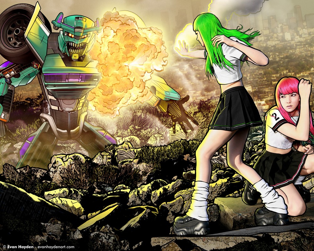
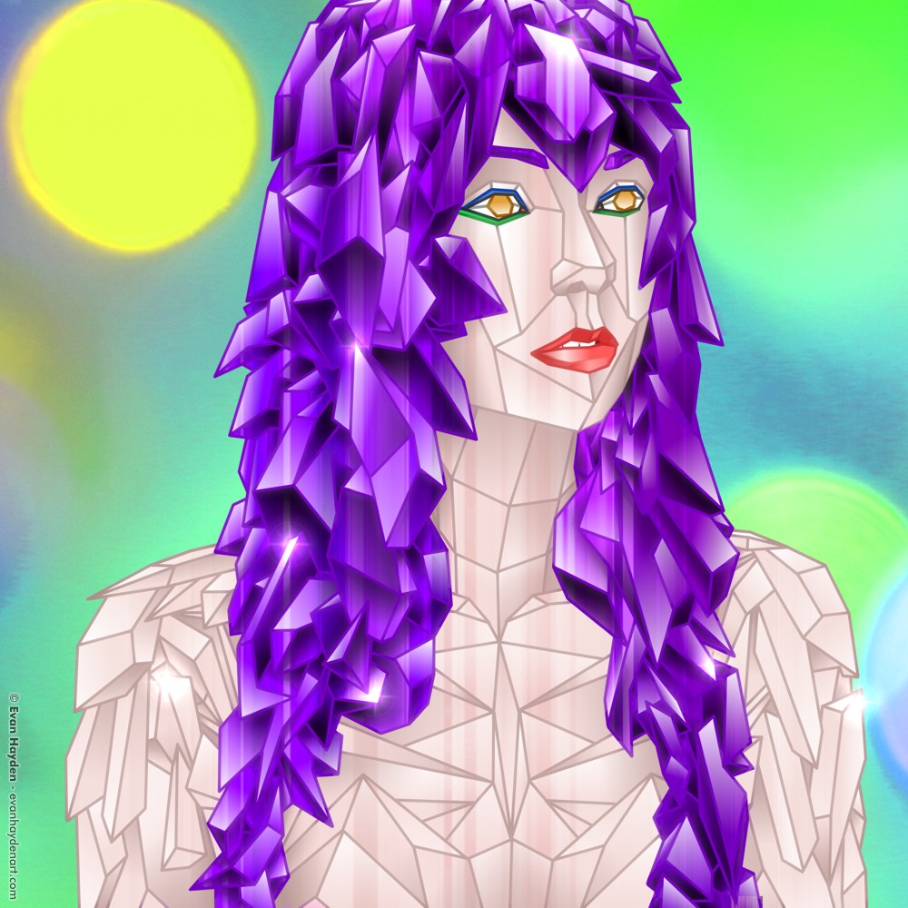
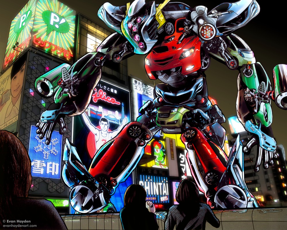
In the midst of an epic battle, twin psychic school girls deal a decisive blow upon a towering giant robot. Pretty much my magnum opus thus far… It’s the third in my giant robot series, but there’s more to it than just that. From my middle school days until the early days of college, I was a huge anime nerd. I also read a ton of manga. These two mediums have had a profound effect on my art style, techniques, and favorite themes to this day. Though I am still being a big manga fan, I don’t watch much anime anymore. I got sort of burned-out, and didn’t feel like I was seeing enough variety in the modern-day anime (with the exceptions of auteurs such as Satoshi Kon, Mamoru Oshii, and Katsuhiro Otomo).


Despite the disaffection with modern anime, I still have a strong love of the stuff I grew up on, tracing back to being a 4 year old and watching Robotech with my older brother. That had a profound effect on me. In this piece, I pay tribute to that, as well as Mai the Psychic Girl, Gundam, Domu, Project A-Ko, Cutey Honey, and other bits and bobs of Japanese pop culture that I grew up with, as well as a little dose of Transformers. Basically as you can see, giant robots and psychic battles are two of my favorite subject matters!


I shot this (the girls and part of the background at least) with one of my favorite models, Raven Le Faye, in Berkeley over a year ago. The robot is made up of over 20 different cars that I shot in Michigan and California. I shot the distant background in Los Angeles. Lots of stuff going on in this… I’m very pleased to finally be releasing it into the world after so long.


On a semi-sad note, this is going to be my last “super epic”, super detailed piece for a while.. It took me too long to make (over 60 hours) as I work much slower in Wacom than anything analog. Most of my illustrated-photography pieces take me between 15 and 30 hrs, which is also a long time, but this one was ridiculous. Just the robot on it’s own would have normally been a piece on its own, but I decided to take this piece farther. That said, I really need to buy a Wacom Cintiq, for a more 1:1 drawing experience – as opposed to the disconnect one gets from drawing on the desk and looking at the screen. I think this would speed up my workflow considerably. Problem is, I’m broke, so until I can scrape together the extra cash, I’m going to have to stick with more simple pieces for a little bit, otherwise I’ll only get one new piece done every several months, which is not enough for me. Good to pause this era (for now at least), with a BANG! (literally, in this case, hence the explosion)


the making of

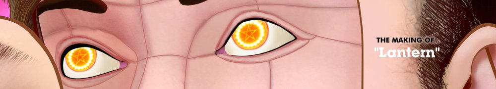
I decided since this new work is particularly special to me that I’d throw in a little bonus. Click the above image, or here, to see a detailed “Making of” / behind-the-scenes for this work.


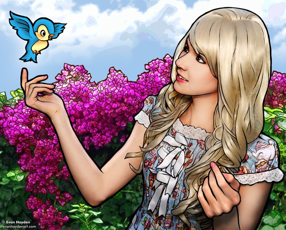
Special thanks to Raven for modeling for this. You’ll see her in a couple other works on the site, and you will be seeing her in more work soon! For example, another illustrated photography piece, a much more simple one that I’ll be getting to soon… Also, she modeled for a pin-up / alt / fetish / nudie set that I’ll be submitting to Zivity soon. That’s very new territory for me, and was a fun experience. Once I get that posted, I’ll direct you there (all of you over 18 yrs old, at least!). Also, I’ll be posting an EGL shoot I did with her soon (and if you didn’t see these really cute pics from a year ago, you should!) Thanks also go out to Ryan Sands, David Murray, and Dawon Kim for giving me feedback at various stages along the way of the creation of this beast! Also thanks to Lady Gaga, Skrillex, Wham!, Dschingis Khan, Arabesque, and the TalkRadar and Gamespy Debriefing podcasts for supplying background sounds for the big push this past week.


In other news, I have more stuff to post soon. Other stuff that I’ve been working on over the past few months, but haven’t had the time to organize into gallery pages yet. A shoot with Beau (some of which is edited and done, some note)… Also the ongoing product photography work I’ve been doing for my buddy Seibei / David Murray, and also product photography I did for Babushka Designs / Tatiana Jimenez. Both of those coming soon (or you could just look at those links and buy some awesome stuff!) You’ll also notice that I upped the font size on the last stuff I uploaded. I’ll be doing this throughout the site soon, I’m just super lazy right now. the old text looked great on lower-resolution screens, but I’m finding it hard to read on my 22″ Samsung, and I’m guessing you might too! Okay, gotta get a little sleep now! It’s after 7am and I’ve been in a creative trance!