| |
"Lantern" was a long time in the making, and ended up
very different than my original concept, different than how it was shaping
up once I started working on it, and will serve a different purpose than I
originally planned.
I've long been fascinated with imagery involving the
removal of a mask, or in sci-fi, the removing of an android's face. Two of my
favorite movie posters include
Westworld and its sequel
Futureworld. Also, the
helmet removal scene in Electroma is really neat. I wanted to
make an image playing off of this idea. I waffled on the idea for a couple
years, wanting to use the general idea, but not make something too
derivative.
I planned on making this for the album cover of what I hoped with be my
long-delayed return to making
music.
I made some tracks on 2013 (here
& here) and 2014
(here
& here) for the project, but it's on hold at the
moment, while I gear up to (hopefully) finish a different album idea (a
concept album themed around my time living in Nagasaki). Let's
call that concept album idea "NS" for now, as it's germane to this final image.
FUTUREWORLD MOVIE POSTER INSPIRATION (LEFT), MY
CONCEPT SKETCH (RIGHT)
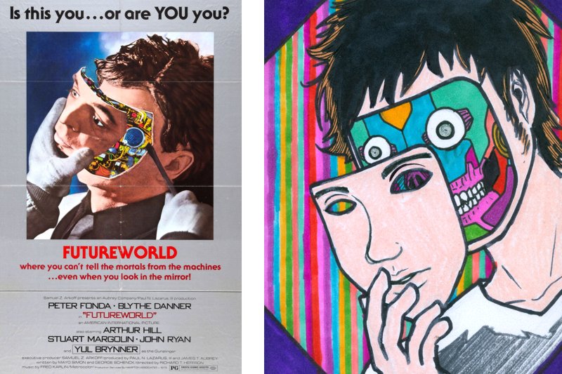
As you see in the concept sketch, I was going to go for a colorful, vibrant
machine face. This is the main concept that changed (The other being me
hoping I'd get thin enough one day to shave my beard and look that svelte.)
As the 2010s have gone by, I've been burning with desire to make music, but
usually being wayyyy too busy with my day job of
lettering manga to really
focus on any big personal projects. When I do have time off, I usually don't
have enough time to decompress from crunch mode enough that I want to spend
a lot of time on the computer, and never enough time to gradually build up
to a creative "flow" for any long-term non-work projects. Also, I tend to
talk myself out of trying because I get discouraged easily when trying to
make music. That said, these desires don't go away. Recently my desire to
focus on making that first album I mentioned (which I plan to finish one
day), has taken a back seat to "NS" the Nagasaki-themed concept album I've
also had floating around my grey matter. I simply have more ideas for NS,
more atmospheric / diagetic samples I've taken around Nagasaki prefecture, and
more immediate *oomph* behind the idea. Thus, I started to think of
repurposing this face-off idea for NS instead of the aforementioned 40%
complete album. (yeah, I know, the idea of "albums" is getting old
fashioned, but I love the idea of them)
I started to think that maybe I could take this face-removal theme and apply
a Nagasaki-theme to it, and use this image for my concept album. To be
honest, I was going to wait with debuting this art online until the album is
finished, but who knows how long that will be, and I've been sitting on this
art for seven months now and it needs to see the light of day. But enough
about that... Let's talk about how I made the image.
First, I needed a self portrait to use...
VARIOUS OUTFITS AND OUTTAKES:
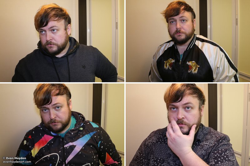
I took a bunch of photos, in various outfits, before I found one where I was
happy enough with how my hair / face looked, and grabbed hand/arm
placement from another shot in the set. I also used my eyes from a
different photo in the set. Lots of surgery here! I had to tweak and
smooth out the lighting a lot too. My strobes are back in Michigan, so I
was limited to just using available bathroom lighting and hoping for the
best.
I ended up using a shot of me wearing my favorite button-up
shirt. I call it my "oyaji shirt" (old man shirt). I love the old-school
Japanese sashiko patterns. (including my all-time favorite pattern,
asa-no-ha/ 麻の葉) I've worn the shirt so much that the material in the
sides is slowly wearing out.
THE RAW PARTS:
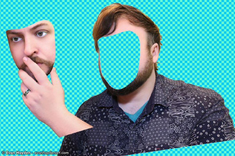
I feel like a bad husband saying this, but I forgot to wear my snazzy
wedding ring in the shoot. I took a photo of it and added it in post. It
might seem like a trivial detail, but the fact that I met my wife Miwa in Nagasaki is a pretty major
part of why I love the city, so I wanted that ring to feature prominently.
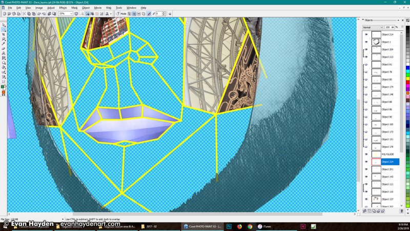
Next up, I started the outlining, but a bit different than my usual Wacom
hand-drawn lines. I wanted to go geometric polygonal look for the face, like
I did on "Amethyst". Here are some shots of the
outlines in progress, as well as some weird shading test detritus that I
can't remember why I had on there...
ALONG CAME POLY:
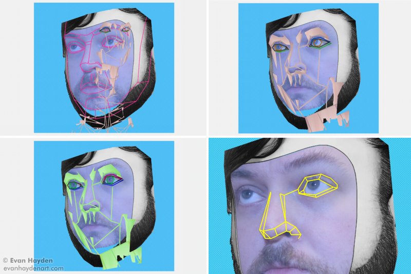
FACE POLYGONS COMPLETE:
My plan at this stage was to use the polygon gridlines as a base from which
to start laying down the details of the inner-face. By now I'd ditched the
idea of a machine face. To fit the Nagasaki theme, I intended to build the
inside-face out of various Nagasaki landmarks I'd photographed. Spoiler
alert: I ditched that idea too, but let's look at how it was coming along
and why I ditched it.
BUILDING FACIAL HAIR OUT OF FANCY ROOFING
ORNAMENTS:
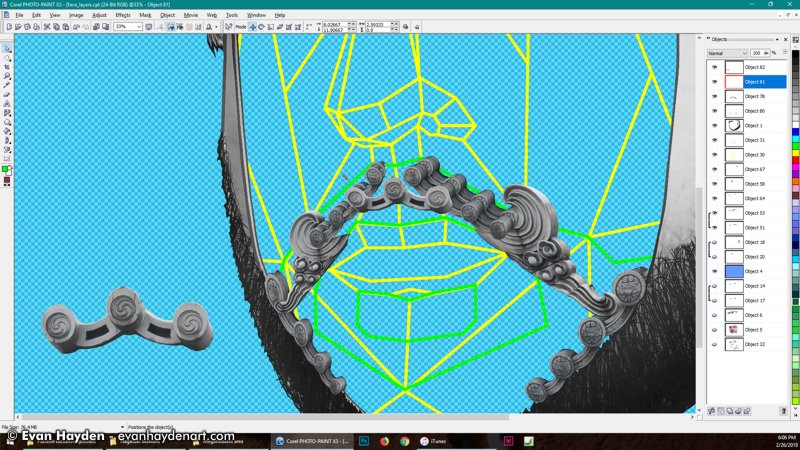
I started out making my facial hair out of various parts of ornamental roofs
around Nagasaki. I thought the curly designs would match nicely with my curly facial hair. So far so good.
STARTING TO PLACE LANDMARKS AND NAGASAKI-RELATED DETAILS:
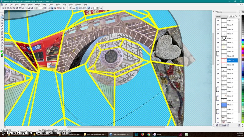
ADDING MORE NAGASAKI MELANGE:
From here, I start to construct a face out of various parts of photos that
I've shot around Nagasaki. Things like
manholes for the eyes,
Meganebashi for the eye lids / brows, one of Nagasaki's iconic
trams in between that,
one of the Meganebashi-area
heart stones... Things still are coming together well.
Not really sure at this point what to do about the cheeks or lips though...
THE FACE IS FILLED-OUT:
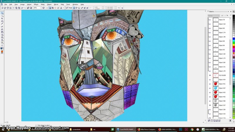
TESTING OUT THE FACIAL HAIR ON THIS BUSY FACE:
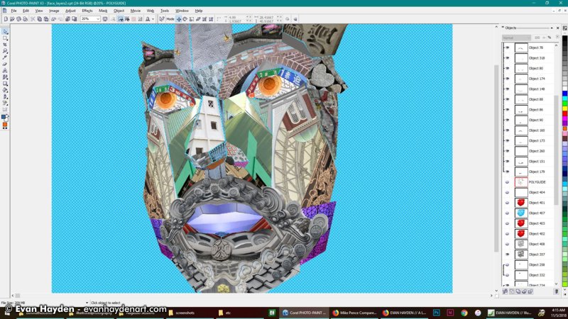
At this point I've added various Nagasaki landmarks and building parts to
all the different sectors. It's looking pretty busy to me. The colors you
see here (with the exception of the eyes), are the original colors of the
photos. I'm a bit worried that it's blending together too much and that at
album-cover size (especially CD or internet-size), it's going to be hard to
visually parse. Nevertheless, I persisted!
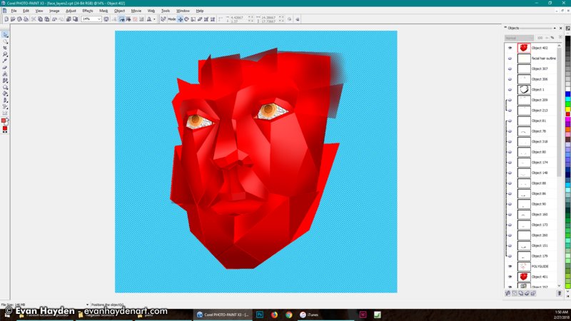
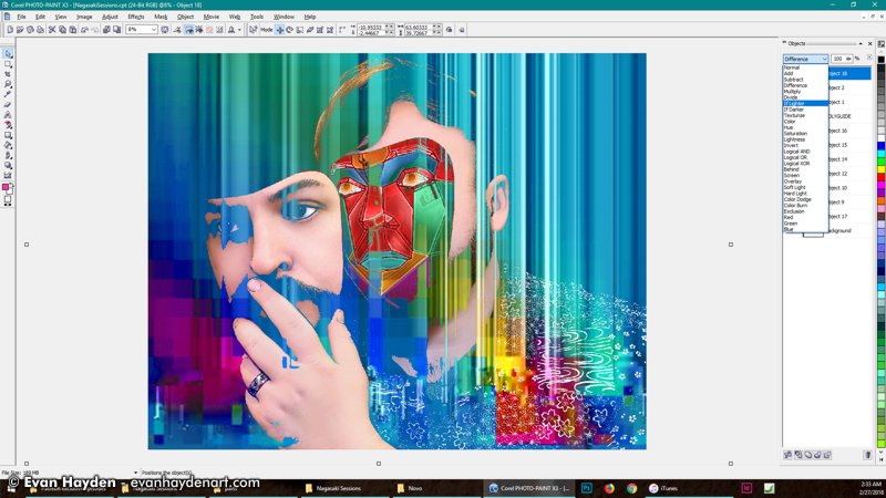
RED RED LIIIINES:
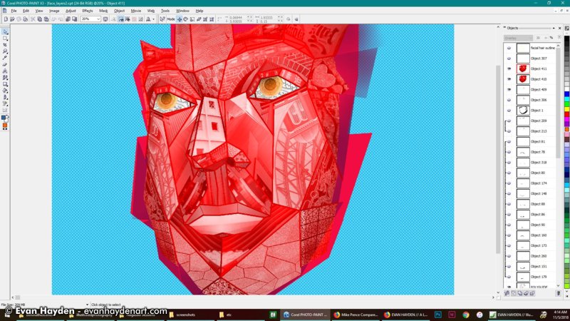
I decided to try a monochrome look. I thought going with red might look a little too much like muscle and blood, and I didn't especially want this to feel
gory (like my last LP's cover), but I was curious to test out something that would contrast with my skin. Looking a little less busy, but it obscured the Nagasaki stuff a lot.
PROFUNDO ROSSO:
Just testing how it looked when removing the Nagasaki stuff altogether, and the outlines, and just having shaded polygons. (PS: I feel
weird calling these polygons, from a graphics sense, because I wasn't making them with a 3D rendering program -
they're all made in 2D - but they are technically polygon shapes!) Anyway, I liked this look... It reminded me of early Playstation 1 games, but it wasn't the look I wanted for the cover. Nothing about it said "Nagasaki".
WELL GOLLY, MY FACE IS RED:
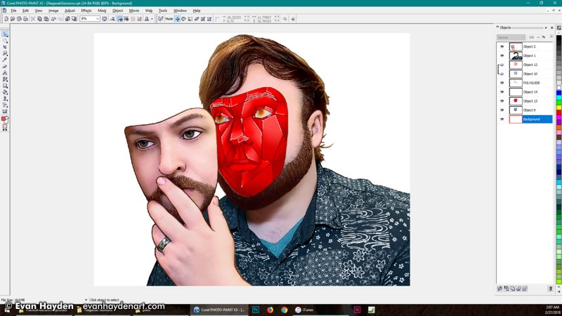
Another test with the red, untextured-look, but with outlines, and placed into the face frame.
I GOT THE BLUES:
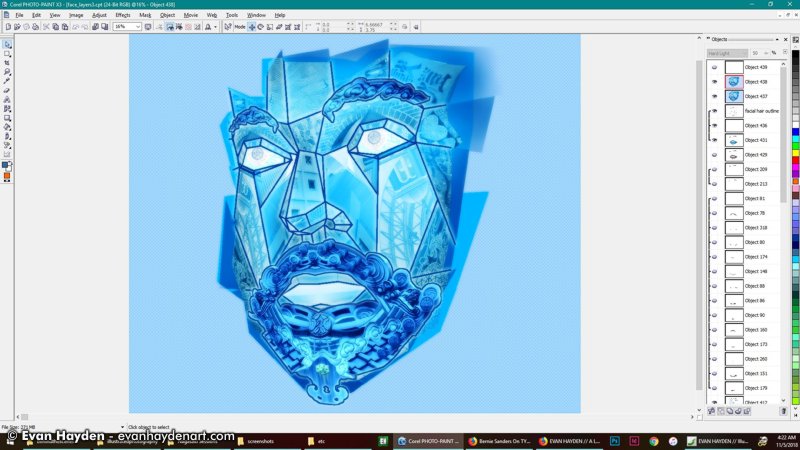
Testing out a different color, with the textures and beard.
THE RAINBOW CONNECTION:
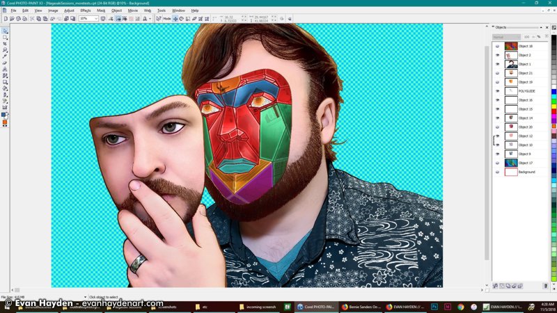
Messing around with a variety of colors, like my original concept sketch. I sort of was digging this rainbow look, but I was facing a situation where if I deemphasized the Nagasaki iconography, the face looked less busy, but also didn't look unique enough to me. That said, so far this was the closest I got to something I was feeling ok with.
MESSIN' AROUND:
Just a weird little thing I screencapped. I was playing around with dropping various textures over the image (in this case a glitch background I've used in some other Macro art). I think I was starting to spin my wheels at this point.
DEVILMAN:
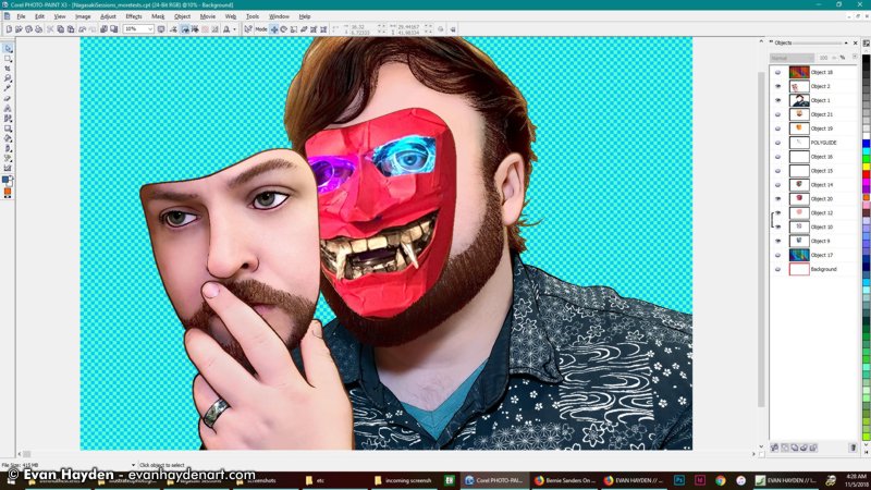
Decided to try something totally different, just for fun. Around this time,
I'd made an oni mask for the
Setsubun holiday. My wife and I went over to scare her friends' kids and eat candy with them. I actually really dig how the devil face looks with this image (sort of feels
Maruo-ish to me), but it wasn't what I needed, thematically, for my Nagasaki-themed album cover. I might revisit this idea later, though... (maybe for a remix album?)
At this point, I'd gotten to where I'd spend maybe 20 hours drawing and testing things and just wasn't feeling any of it for the vision I had for this album cover. Nothing seemed to be clicking and I was having a hard time making something that would both have lovely Nagasaki-details and still be visually legible when seen small. I ended up taking a break. This was February 2018....
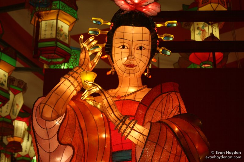
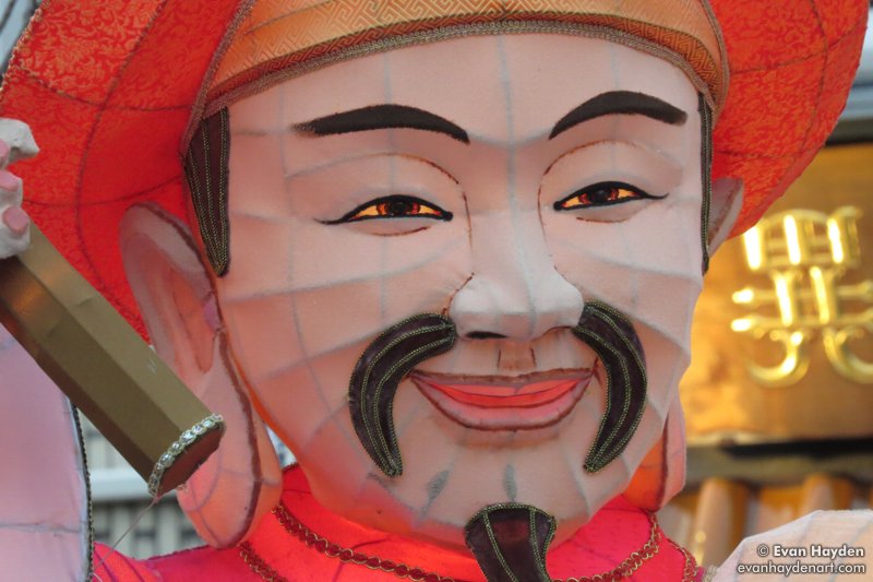
What happens in Nagasaki every year in February? None other than the
Lantern Festival! Two weeks of the city being decked out in tons and tons of lit-up, huge, elaborate paper lantern statues. Lots of awesome festival food, acrobatic performances, music... A really fun celebration of Chinese New Year and China's cultural impact on Nagasaki. Wandering around my fifth Lantern Festival, taking photos, I got some ideas for a different direction for my piece. Here are some of my pics from the Lantern Festival, to give you an idea how things look.
NAGASAKI LANTERN FESTIVAL:
I meant to get right back to work on this art with a new idea in mind... Making myself into a lantern. Problem is, work got really busy around this time, and I didn't get a chance to revisit the piece until a couple of months later.
LANTERNIZING MYSELF:
It's just as well I had to take a break. I came back to the project in April, feeling refreshed. I started grabbing parts from lots of different photos I'd shot of lantern statues, in order to put together a new face. I made a beard and mustache out of facial hair parts from one of the more
hirsute lanterns, being careful to try to match them to the shape of my own facial hair.
Made eyes out of the
Nagasaki flag crest once again, but in a similar color to my own hazel eyes. Then I chucked those and went with the crazy glowing yellow again.
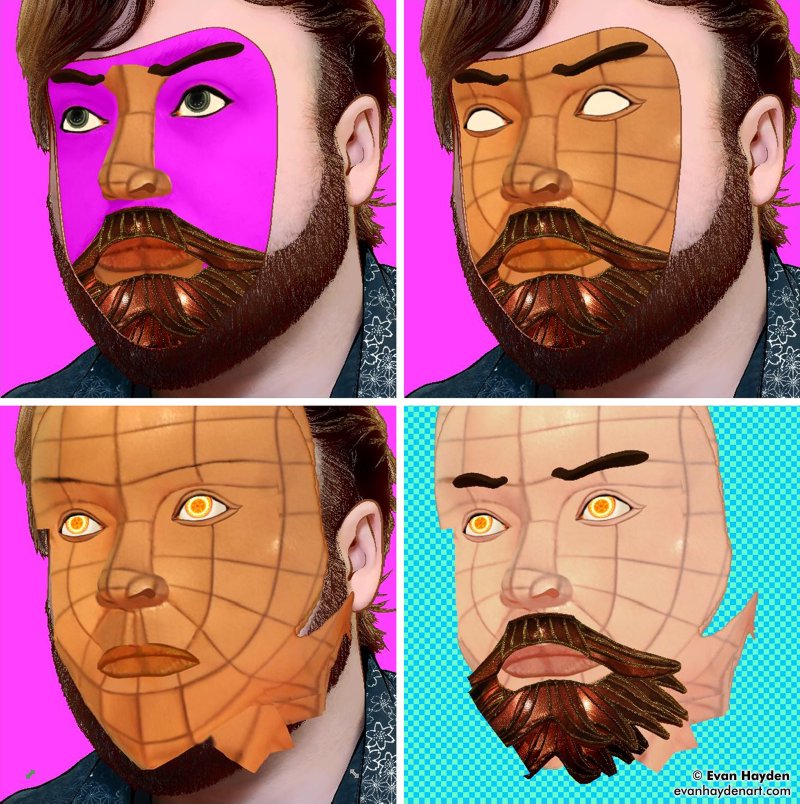
The next part was more tricky: Making skin from the base of an existing lantern,
on which I did substantial "surgery", to better fit the shape of my face.
My wife was pretty horrified to see this, in-progress, haha.
LONG LIVE THE NEW FLESH:
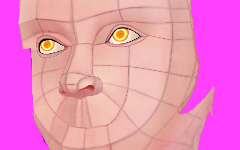
From here, I worked to smooth-out the skin texture a bit. Also sharpened up the outlines of the wireframe on the face a bit. Added more shading and highlights, and changed the skin color to be a bit closer to my flushed white-boy face.
After that, I placed the lantern face into the rest of the body frame, then
started to test out different backgrounds.
LITTLE FLUFFY CLOUDS:
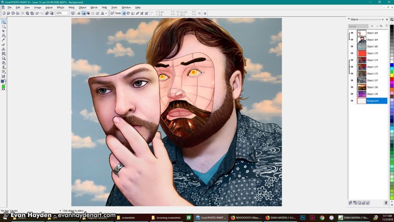
I actually really like this, but I ended up not going this route. The background is a photo I took of wallpaper of hand-painted artificial-looking clouds
at a salon in Nagasaki. I really like the look and want to use it for something, but wanted something a little more distinctly Nagasaki for the background.
(Maybe I'll use the cloud background for something later?)
HOUSE MOUNTAIN:
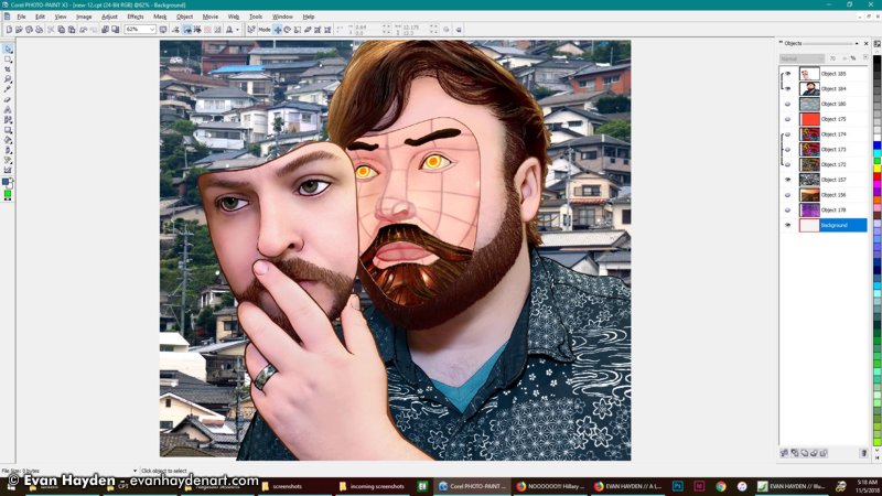
This is a photo I took of an imposing tower of houses on a mountain near my old apartment. I think
the background image is strong on its own, but as a background to this, it was too much.
(I ended up using this background a year later on
a different illustrated-photo piece.)
TANGERINE HEXAGON SUN:
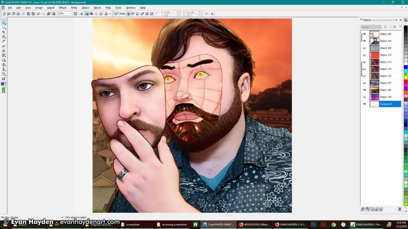
Another photo I took from my old balcony. I liked the colors with the foreground image (good old dark blue with bright orange) but it still didn't work for me quite right
as a background.
MORE PLASTIC SURGERY:
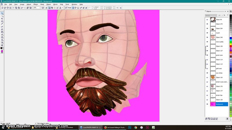
While I thought about the background, I took another pass at my face. Tweaked the skin color a bit to better match my own (previously was a little
too pink). It's still a shade darker than my own skin, but that's to make a little contrast. The hue is closer now.
I also changed the eyebrows to look less angry. The world needs less anger.
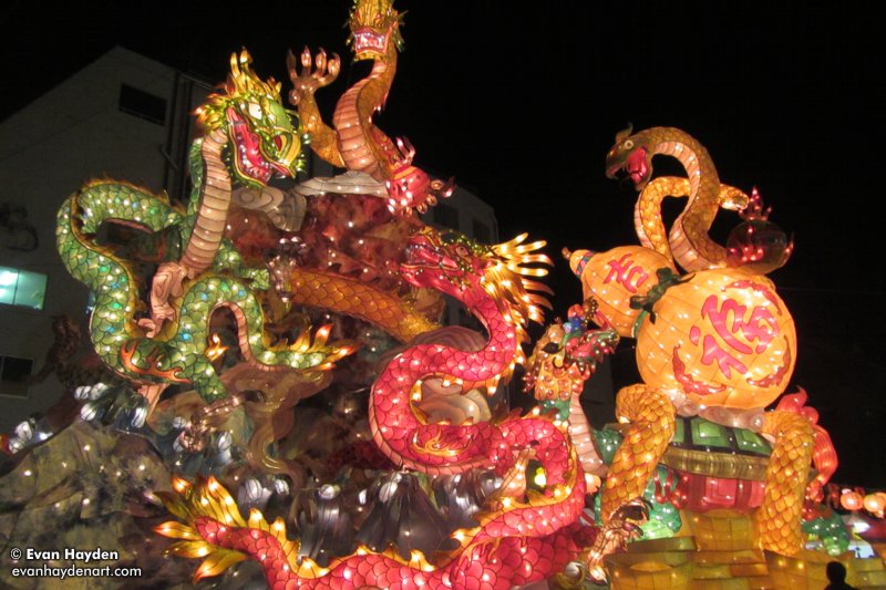
GLOWING DRAGONS:
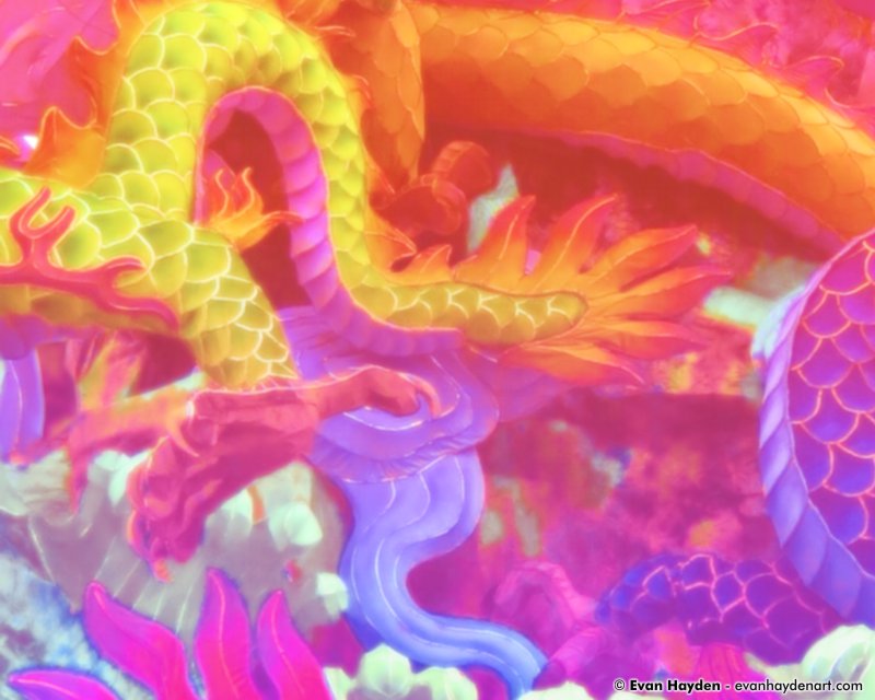
I returned to testing things for the background. I ended up taking a close-up of a photo I shot of giant dragon lanterns (like the ones you see further up this page), and heavily tweaked the colors and radiance, to look
more vivid and dreamlike. I've always felt like my years in Japan have been like a timeless dream and whenever I
come back to the states, it's like waking up back to reality. I thought the neon glowing colors would add well to the bizarre feeling I wanted from this piece.
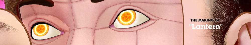
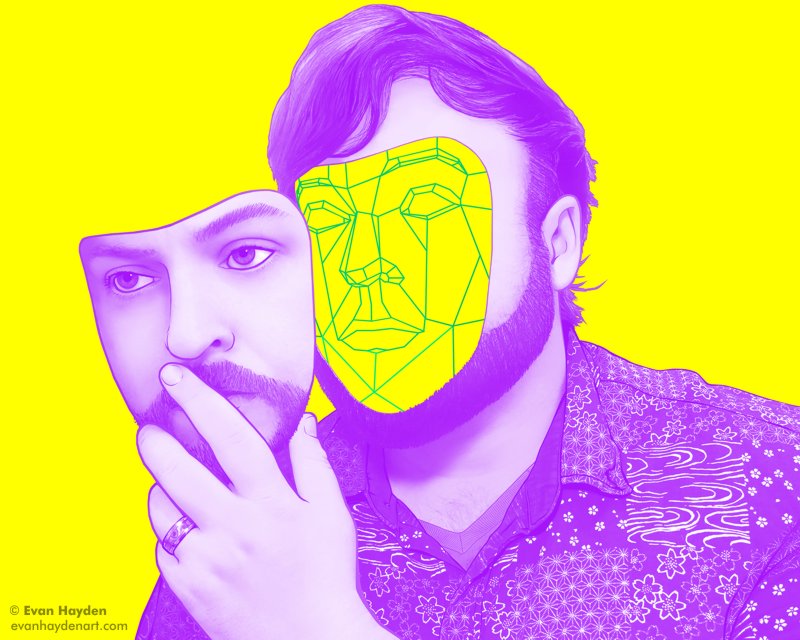
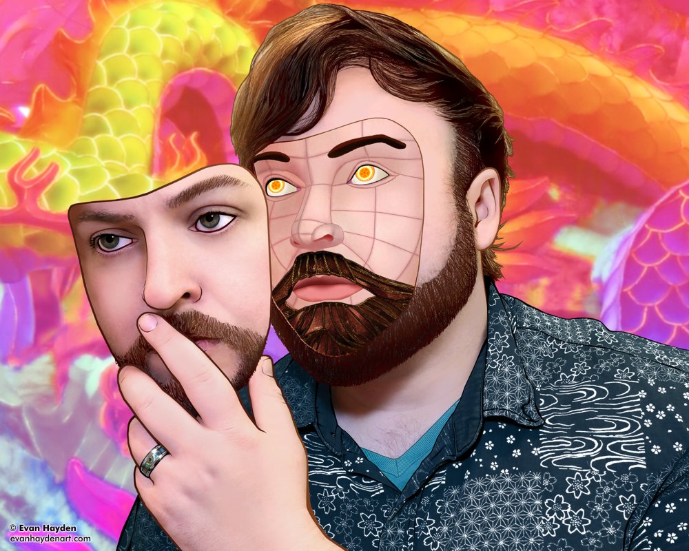
THE FINAL PRODUCT:
|
|
|
| |
Done! I added the new face into the body / hand / outer face framework I'd made
earlier, then popped that onto the dragon background. Played around with a few
more overlays, but ended up leaving it clear and crisp. Tested it out in the design of the album packaging I'd started (for an album that as of this typing has ZERO finished songs, haha) and it fit well with the design. This ended up being very
different than my original idea, but I think stronger because of it.

|
CLICK HERE TO GO BACK TO THE
MAIN GALLERY PAGE FOR
LANTERN! |
|
|
|
|
|
Site contents and design © Evan Hayden |
|
| |