Hello world!
It’s finally done… After five years I finally gave my art site a complete overhaul and it’s now online. This is my biggest site redesign yet, and I started over from scratch. Here are some of the changes I made:
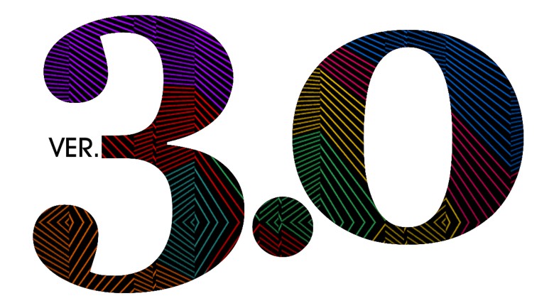
- New aesthetic design. The theme could best be described as “rainbow”. Each gallery section now has its own unique color scheme, for example purple for Illustrated-photography, blue for Photography, and so on. If you’ve been visiting my site for a long time, the background may seem familiar. I always liked the random jaggy thin-line pattern background of the old pre-evanhaydenart.com days, so I brought it back, but in this case, it’s a different color in each gallery. Also making a return is one of my favorite typefaces, Herb Lubalin’s “Avant-Garde”, making up the navigation section lettering. It’s a more sedate usage of the typeface than he did, but I think it works fairly elegantly for the nav boxes. Speaking of typefaces, I stopped using Lubalin Graph (Another Lubalin classic. He was an amazing designer!) since I used it to death on version 2.0’s design. I’ll still use it on blog post promo images, because it is my favorite typeface, but for the main site, I went with something a little more familiar… Georgia! Yep, everyone has this font, and maybe it could seem boring, but I like it a lot, so hey… In other news related to the new design, all the thumbnail images and text is a little bigger now, to account for larger monitor sizes and resolutions, and to make for easier viewing on mobile devices. Also, the page headers still show a different image upon each page load, but now they’re color-matched to the rest of the page. So many different files were made for that…
- Flashier index page(s). Speaking of rotating images, the new index splash page is definitely splashy! A new background loads upon each visit to the page, and fills the screen. I’m sort of picky about the new trend of GIANT leader images for articles and whatnot, but I think for a gallery front page it’s fine. I also tried to make this page work a little better on mobile devices.
- New, wider layout. I ditched the two-column design for a single-column design, allowing me to use bigger images (seems fitting for an art gallery site, right?) The navigation is now at the top of the page, under the header.
- Big big big! About those big images, I apologize for anyone on slow internet connections, but I decided to go all-out this time… Each gallery page has big 1000px wide images for the artwork, and in the case of some pages where the art is a series of pictures, several of those big images. I feel that for an art portfolio site, big splashy images is good, and enough people have high-speed internet these days that I feel pretty comfortable designing for that now. It might be a headache on mobile networks if you’re at 3G or below, and I know that’s where a lot of people view the internet these days, but I firmly believe an art site is best viewed on a decent sized monitor.
- Mobile-ish. On the topic of mobile-internet, I haven’t yet figured out how to make a totally mobile-friendly site yet (I’m not a programmer, I just struggle my way through each redesign when I absolutely have to), but even though some of the images are pretty big now (which load just fine on 4G), the layout this time around is at least a bit better for mobile. There’s some text you need to expand to see better, but the site doesn’t totally fall apart when viewed on a cell phone like my old site did. If I had the time, I would make a separate version of the site just for mobile, and have the code redirect you there when you view it on a phone, but I’m way too busy with work right now to do that, so please hang in there until I can 🙂 This site took long enough as is to redesign (a couple hundred hours, easily) so I may have to wait until I can afford to hire a designer to make a more mobile-friendly version for me.
 Other changes… I reorganized the site. After seven years apart, the fashion / portrait photography and automotive photography pages have been consolidated back into a Photography page. Since I haven’t been doing many proper shoots of cars lately, that page seems a little flimsy to warrant its own separate gallery. Also, all the separate gallery archive pages have been consolidated into one Archive page. Another change now involves the bio, links, and store pages being consolidated into an About page. I added some stuff to that about page. The resume / biography is still there, as are links. I added a FAQ page, a Contact page, and a proper Store. The FAQ exists to try to handle some of the questions I get repeatedly over the years… the Contact page is pretty self-explanatory, and now doesn’t involve me having to divulge an email address (thanks Foxyform!)
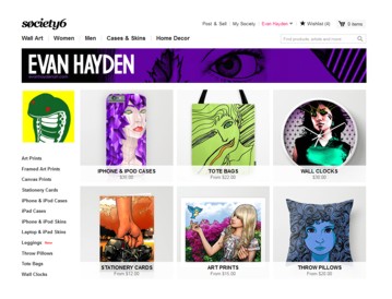
- Store! Finally! The store is the big addition… After, oh, seven years of promising I’d add a store to my site to make it easier to buy prints, I finally did, with Society6. Part of what caused the delay for so long was my 2008 hard drive failure, which caused me to lose a lot of original art. Once I rebuilt my portfolio and had some good stuff to sell, it was a combination of being busy and being honestly a bit intimidated by the whole thing. Society6 should be a good solution because I don’t have the time right now to print and send orders myself, and doing so from Japan is its own kind of headache. Society6 fulfills the orders for me, and they have a good quality to their work. So yeah, finally, if you want to order prints of my work, or other stuff (pillows, cell phone / ipad cases, laptop skins, leggings, duvet covers, shower curtains, etc!), please check out my store!
- NSFW-avoidance, if you want it. I separated the NSFW / 18+ only artwork a bit more from the rest of the content. I don’t want to censor myself, but given the nature of my day job, teaching kids, I wanted to make it a little harder to stumble across stuff that might not be suitable for the office or for younger eyes. Now, when you go to certain galleries, such as Illustrated-photography, the subsection with nudity or violent images is clearly labeled as such, in English and Japanese, and separated from the other content. If you’re using the back / forward buttons to navigate from page to page, it will stop when it gets to the NSFW content, sending you back to the main gallery, and you’ll have to click the thumbnail of the NSFW stuff to see it. No passwords or any stupid stuff like that. I just wanted to keep things accessible to those who want to see it, but stuff harder to have an “oopsie” moment and see it when you weren’t expecting it.
- I mentioned Japanese… One thing I was planning to add to the launch, but decided to wait on a little bit longer, is Japanese translations for a lot of the major content. I already did them, in my mangled Japanese, but I have a friend who’s helping to smooth them out, so I’ll add said translations soon. The site is still prominently English-language, but at least for the main gallery indexes, there will be Japanese as well. For the individual artwork pages, there will be just English, but those are more about the imagery anyway, and I type too much sometimes, so maybe I’m actually sparing my Japanese viewers a bit!
- New blog. As mentioned in the last blog post, the Blog has been 100% redone. After I bungled things and lost my blog archive, I took the time to redo all the old entries based off of salvaged data from the Internet Archive (but lost the comments, sadly). I also added some “from the future!” content to some of those old entries, ie: photos from events that happened. The new blog works much better on mobile devices. Well, to be honest, I used some WordPress trickery to make the site load a separate version for viewing the blog on a cell phone, and it’s not super pretty, but at least it’s not broken. It’ll do for now, until I can figure out how to customize it to make it have a bit more in common, design-wise, with the desktop site.
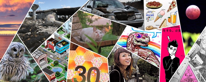
- What else? I added a TON of new artwork to the site… The Illustration gallery now has a section dedicated to educational art, of which I’ve been making a lot at my day job. This section includes an in-depth look at the “Hello English Picture Dictionary”, which is a publication I designed, edited, and illustrated. Also featured are worksheets I’ve made art for, and the “Word-of-the-Week” whiteboard that I draw each week for my students. Go check all that out! The Photography gallery has a new “Etcetera” section now, with photos of cats, birds, urban wreckage, night photography, and other things! Also added to the Photography page is some of the photos I’ve shot over the years of mangled and neglected vehicles and more robot photos! Growing up in the rust belt made for many such opportunities. I added new art to the Illustrated-photography gallery – an ink one, my first such piece like that in eight years. It’s of my lovely girlfriend Miwa. Finally, I added some new stuff to the Design gallery, including more mix CDs with custom packaging, more flyers, and a more depth look at my manga lettering.
- B-B-B-BONUS. One thing you’ll notice on many of the artwork pages, is a lot more bonus content. More details, more behind-the-scenes, more more more! Also for each artwork that is available to buy on Society6, it’s linked within the page, and for manga and zines, there are links to buy the books from their respective publishers.
Okay, I think that about sums it up! Jeez, sorry to type a novel here, but this is the biggest update ever to my art site and there was a lot to cover! I’ll have more art coming soon, so stay tuned!