| |
This is a page to show you some of my workflow in making my tribute
to the anime that I grew up on, "A Love
Letter to My 13-Year-Old-Self". If you'd like to see the regular gallery
page (you probably came from it anyway), click
here to go back, and there
you can read in more detail about the concepts behind the piece, and how it
links in with several reoccurring themes in my body of work.. Before we get
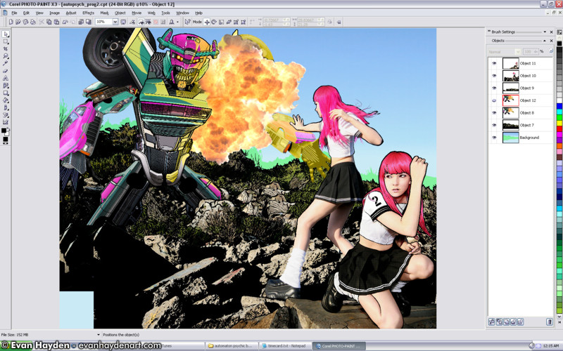
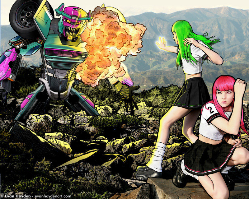
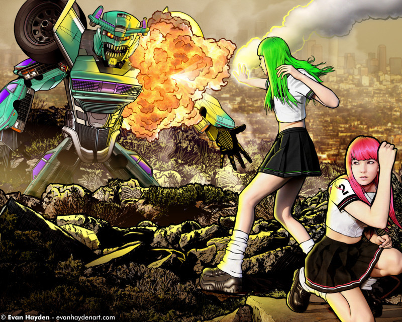
started looking into how I made the piece, here's the final image, as a
refresher:
Let's take a journey...
First off, let's start with the photo shoot itself. The lovely
Raven, who has modeled for several of my other pieces, accompanied me to a junk art park in Berkeley, where we spent a day shooting for several different projects. I'd previously shot here with
Annie and Mirela, and really loved the location. Now, to give you an idea of how long it took me to finally get around to finishing this 60+ hr epic, I shot Raven for it in April '10, and finally finished the piece in June '11. I definitely can't be accused of working fast on this stuff! Anyway, here are the two shots of Raven that I used, unedited...
UNEDITED ORIGINAL SHOTS OF RAVEN:
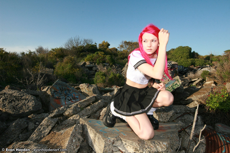
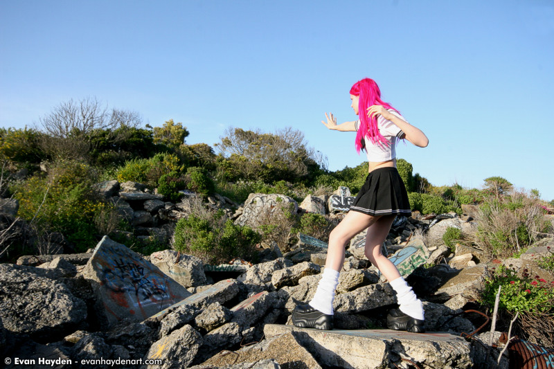
I gave her bangs to better fit the look of the "psychic school girl" anime trope. (Plus, I'm a sucker for bangs, what can I say?) Also took away the graffiti on the rocks, as I didn't think it quite fit the look I was going for. I wanted to go for a landscape that looks like it was freshly ruined (by the robot), as opposed to something that's been around long enough to get tagged.
CANDID - PACKING UP MY CAR AFTER THE SHOOT...
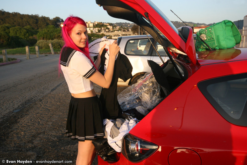
Raven has a veritable cornucopia of awesome cosplay stuff, several of which we've shot. I'd recommend her to any photographer who wants fun pictures!
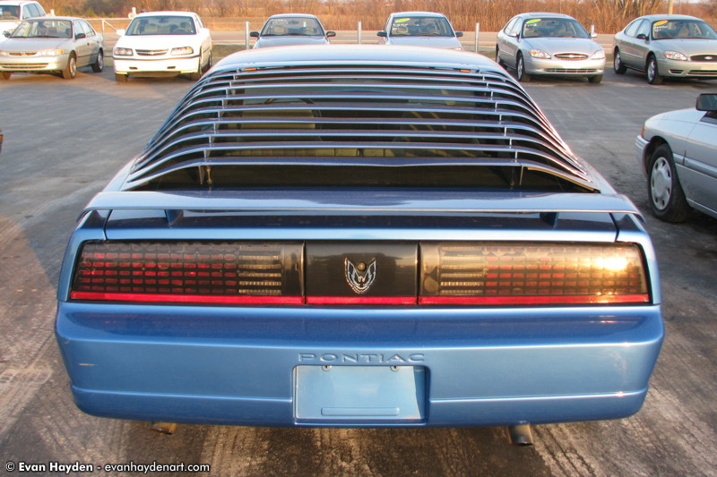
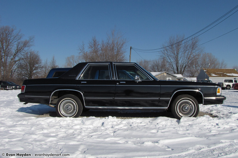
Okay, after several hectic months of moving around between Michigan, Los Angeles, Vallejo, and Oakland, as well as having a lot of freelance design work that needed to take precedence, I finally got started on the rest of the image. Here are a couple of the cars I used for robot parts. I used parts from over 20 cars, ultimately... I'm always taking picture of cars all over the place, so luckily I had a huge catalog to choose from. For this robot, I decided to use late 80's / early 90's American cars as the theme.
USED IN THE CHEST AREA, A PONTIAC FIREBIRD, SHOT IN MONROE MI:
USED IN THE THIGHS, A MERCURY GRAND MARQUIS, SHOT IN MONROE MI:
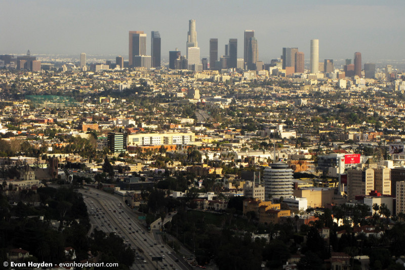
For the background, I used a shot I took of Los Angeles, shot from the side of the road on Mulholland Drive. I heavily blurred it however, so it would eventually serve more as an accent than a focal point.
BACKGROUND - LOS ANGELES, CALIFORNIA:
Okay, let's get down to the nitty-gritty. I took screenshots along the way as I composited the various pieces together, illustrated them, and then fine-tuned everything. The piece went through several different color schemes and arrangements, before I reached a point where I was ready to put it out into the world. First, let's take a look at "where the magic happens" (haha)...
MY SPARSE DESK:
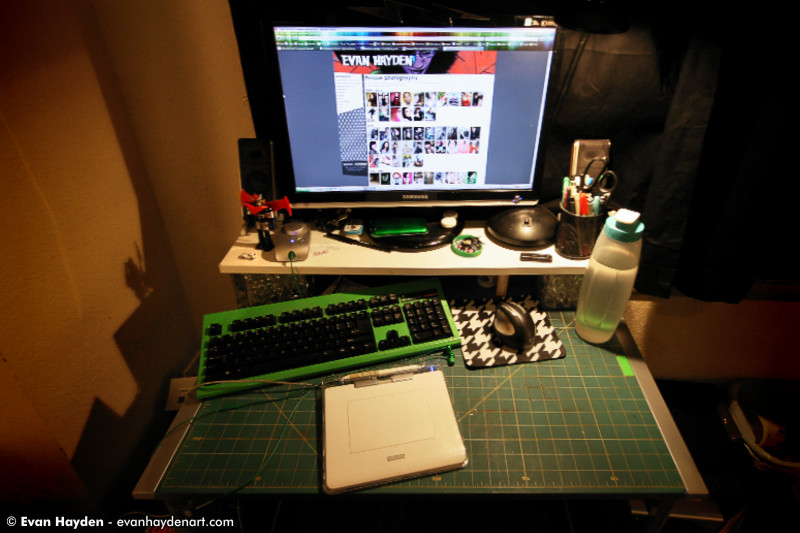
Pardon my lack of decoration. I just moved in a week ago.. Okay, enough messing around, Let's check out the hard work part! (aka 58 hrs of image editing and illustration):
LAYING OUT PARTS:
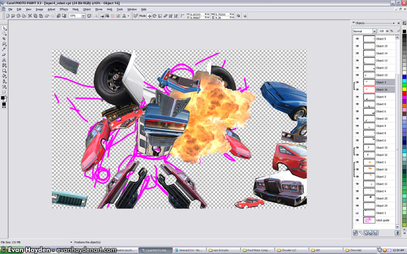
Laying out various car parts, roughly in the shape of a robot. The robot was originally going to have a very different face, more of an inhuman, insect-like design.
FACE SKETCHES:
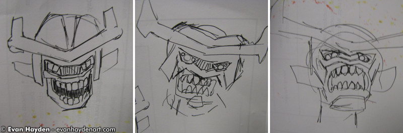
As you can see in these rough sketches, I was trying to decide at this point if I wanted a psychotic, startled, or upset robot. I opted for RAAAAAAGE!
BUILDING THE FACE:
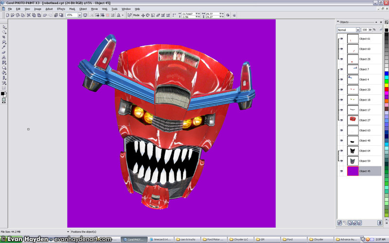
Building the face out of various car parts. Now let's get back to the construction of the body...
ADDING TO THE BODY:
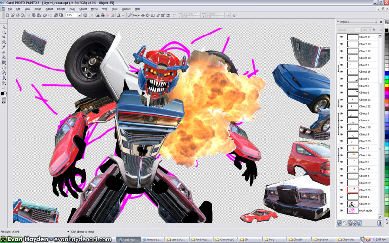
Clutter everywhere. The general shape of the robot is just about done.
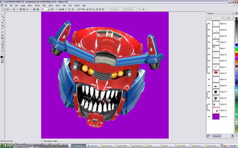
FINE-TUNING:
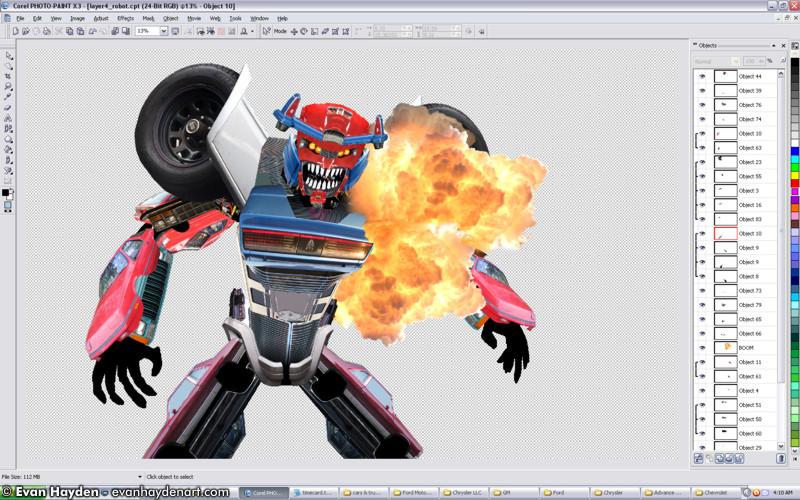
Clearing up the clutter. Next up we get into the early stages of layout of the rest of the image...
LAYOUT ARRANGEMENT:
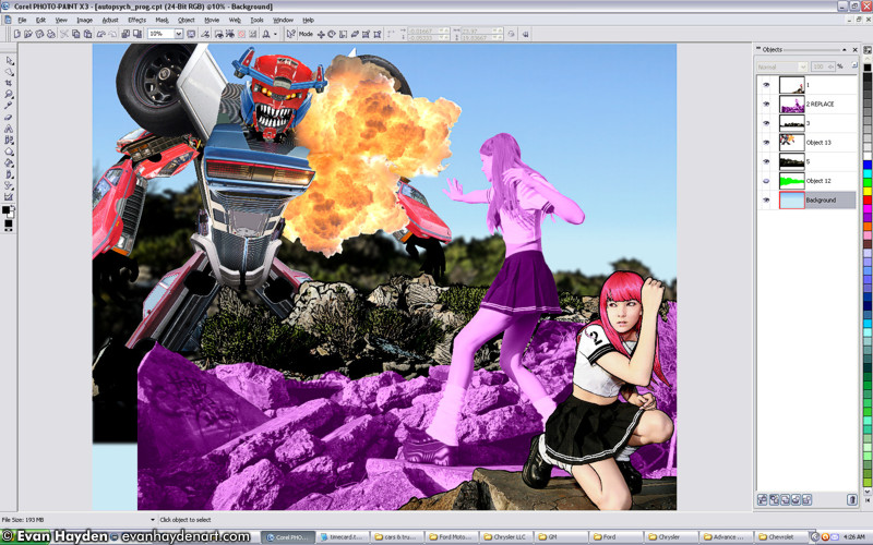
At this point, I had the foreground twin (pink hair) done, but hadn't touched the green-haired one yet. I made that layer pink just for testing purposes to make things startout from one-another.
TWEAKING THE ARM PLACEMENT:
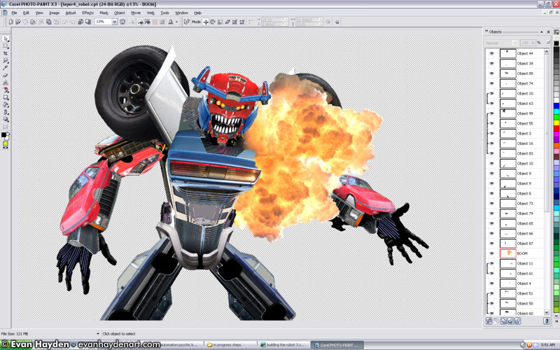
Fine-tuning Mr Roboto. Changed his arm placement a bit.
COLOR SCHEME CHANGE:
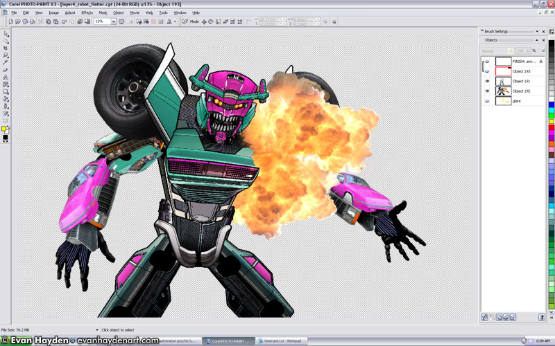
Okay, now we're getting somewhere. I finished most of the illustration of the robot at this point. I also changed his color scheme. In previous "Automaton" pieces - my giant robot series - I stuck with the original car colors for the various body parts. I like the rainbow effect of that. For this guy, more of the original colors were blue and red, and he was looking a bit too much like an evil Optimus Prime, so I switched it up. I thought this teal and magenta would be nice and early-90s looking.
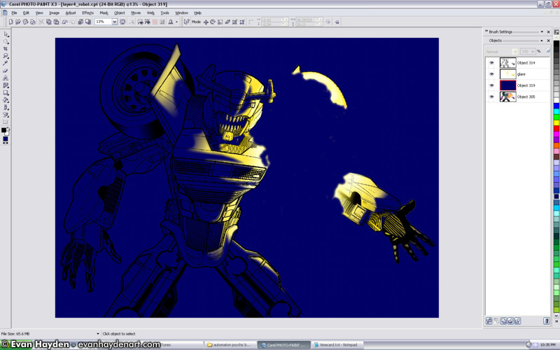
GLARE TESTING:
Starting to work on the glare from the explosion. Originally wanted to go with the sharp-edged highlights you see here, as they better echo the way glare is portrayed in old anime, but I opted for a smoother approach, since the rest of the image was heading in a more polished direction.
GLARE IN ISOLATION:
...the glare in isolation.
GLARE IN PLACE:
Smooth glare is added. Now, just for fun, let's look at a couple glitches. These files were starting to get HUGE, and eating up lots of system resources, so occasionally Corel Photopaint (yes, I'm a nonconformist!), would glitch up. I took a couple screenshots of the more unusual ones...
GLITCH:
I don't even remember how this happened. I think there was a delay when caused by my system chugging along when I was trying to lay down a little blue line.
GLITCH:
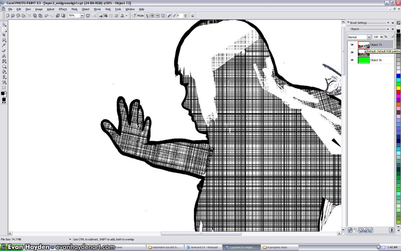
This is one of my "favorite" glitches that Corel has when my computer is about to crap the bed. It'll get to a point where certain layers will appear to "not be there" when viewed at various levels of magnification. Luckily this is rare, and only when I'm severely low on memory, but it usually ends up with me having to restart the program. Not sure what was up with that cross-hatching. Crazy...
REMINDERS TO MYSELF:
After a 7 hour binge of productivity on that particular night, I made some temporary notes in the image for things to figure out when I returned to working the next day. I often do this when I've been up until 6am working and just need to force myself to sleep. You'll see here that I was messing around with a mountain background (shot in LA), but I later nixed that for a shot of downtown LA.
SMOKE TESTING:
Dropped in a photo I took of a smokestack in Michigan. I messed around a bunch with the transparency to turn it into smoke & dust rising from the valley, but I took this screenshot before I did that because it looked interesting and mysterious to me.
BEAM TESTING:
Originally was going to have a big beam coming out of green-hair's hand, but every approach I was trying looked super hokey to me. I instead opted to have it be a split-second later, as the beam was just finishing connecting, and when smoke was starting to emanate from her hand. Above you'll see one of the earlier, scrapped ideas.
MORE TESTING:
No beam here. Just rearranging things a bit.
MOOOORRRE TESTING:
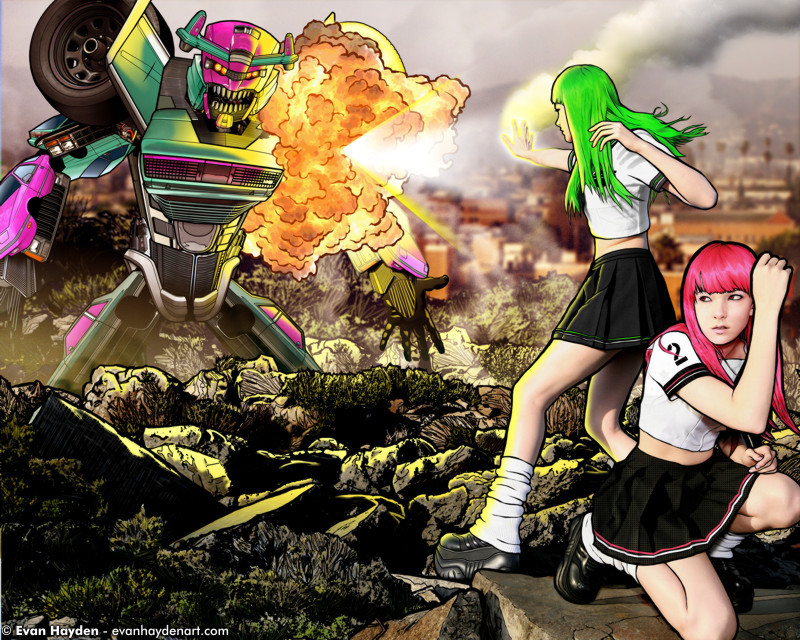
My first crack at the "residual energy" idea was still a little too intense looking, and a little confusing as well. You'll note in the above image that I was playing around with an alternate Los Angeles cityscape before I later settled on the farther out shot.
NEW BACKGROUND:
Here you'll see the final background selection, as well as a deemphasized beam.
COLOR TESTS:
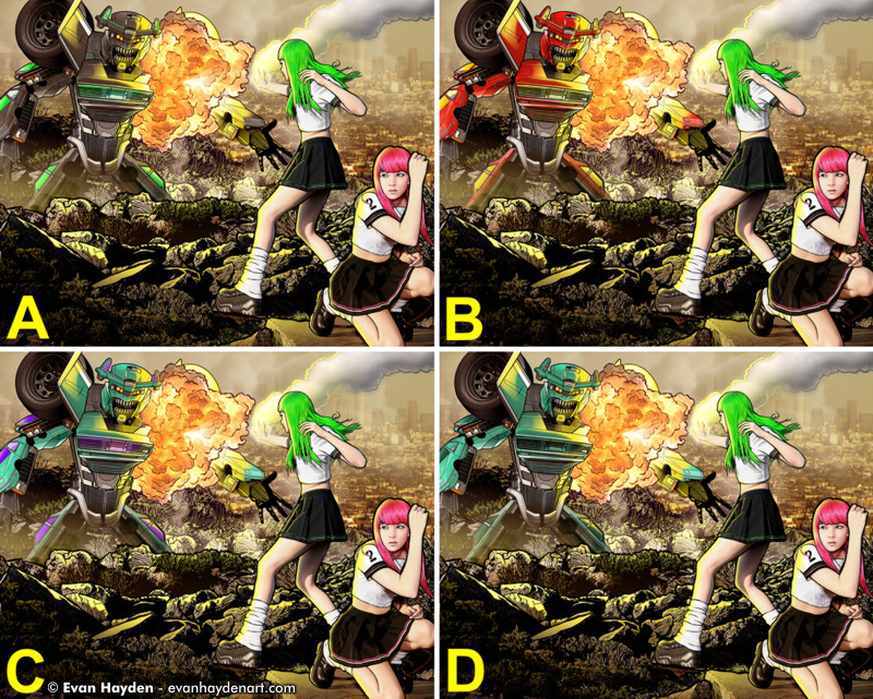
At this point, I was starting to feel fussy about the robot's color scheme again. Out of the context of the rest of the image, I loved the teal and magenta, but I felt like it was clashing pretty badly with the green and magenta hair. Above you'll see four variations I made for the new colors. I almost went with B, and I really like it, but it screamed "Iron Man" a bit too much to me. I opted for "C". Still has that early '90s look I was originally going for, but is a little farther away in hue from the hair than the previous color scheme.
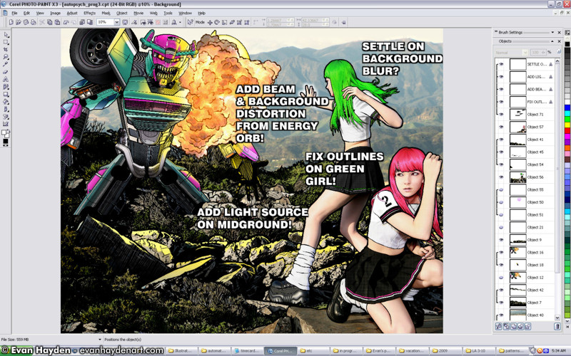
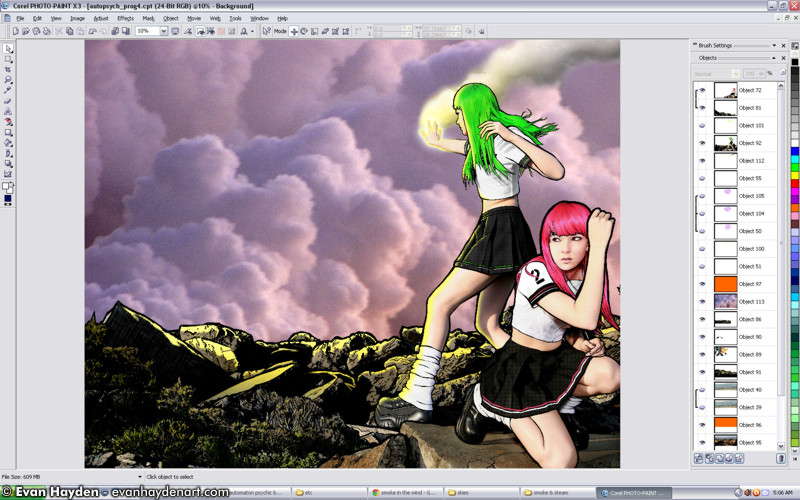
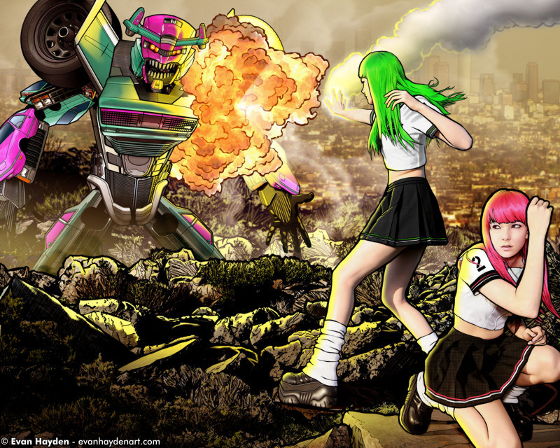
THE HOME STRETCH:
Almost there. Something still seemed a little awkward to me about the framing of the picture as well as the placement of the psychic twins.
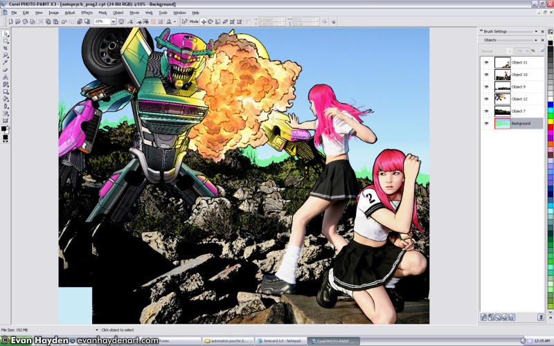
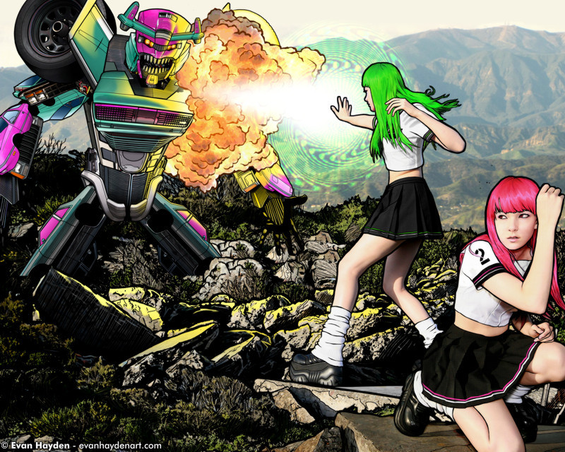
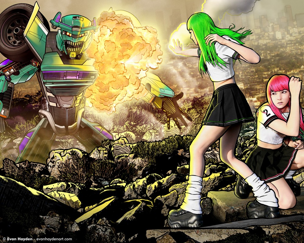
THE FINAL PRODUCT:
|
|
|
| |
Okay! Here we go. At the last minute I decided to tilt the camera angle in a little more exciting way, as well as tweaking the foreground and background layers a bit. Most noticeably, I moved pink-hair (no. 2") behind green-hair ("no.1"), and despite the fact that it now looks a little less like she's being protected, I like the placement much better in the context of the rest of the piece. You'll also noticed that I tweaked the explosion a bit to make it brighter, added more smoke, and added some extra details to the robot. Most artists will never agree that a piece is "done", as you can always keep tweaking things, but at this point, I felt like the image was finally ready-for-primetime. I hope you like it!
TOTAL TIME SPENT ON THIS PIECE:
over 60 hours. My longest time yet. *whew!*
SIZE ON DISC OF THE ORIGINAL, FULL-SIZE LAYERED FILE:
1.3 GB (that's not counting the various separate files I have with the robot in 30+layers) This is the partially flattened file!)

|
CLICK HERE TO GO BACK TO THE MAIN GALLERY PAGE FOR
THIS ART! |
|
|
|
|
|
Site contents and design © Evan Hayden |
|
| |