catching up with the Deathscape Navigator

Deathscape Navigator

Added some recent album packaging designs, one from this past summer and one from last year (belatedly). Above, you’ll see the cover and back cover of my album “Deathscape Navigator”. Click above, or here, to see the rest of the packaging art! Below, you’ll see the cover and back cover for the mix CD set I made for Ryan last summer. Click below, or here, to see the rest of that compilation’s art!


Catching Up...

Party on!

Flock Together

Flock Together

Hey folks! I’ve been dreadfully busy, as usual, but I made a little time when I was visiting Michigan recently (where most of my art supplies are) and made some new art. This piece, “Flock Together”, is the fourth in my series of pretty women with cute animals that I’ve been doing each of the last four autumns. I was planning on ending the series with this fourth one. If I get in the mood, I might make a couple more in the future, but for now, four seems like a nice even number to end it on. Click the above picture, or here, to see bonus stuff!


In other news, I went through the site over the last couple days and fine-tuned it a lot. All of the image thumbnails are bigger now, fonts are tweaked, and each main gallery page has a more colorful header. I also moved some more stuff to the Archive page, and took a few really old stuff off said page. I have a few new things I’ve been meaning to add, but will do that soon when I have a little more spare time.

Captain America VS The Nazis

Feeling deeply troubled by the news of the racism and violence in Charlottesville, I decided to make something cathartic, and a tribute to Jack Kirby’s great 1941 Captain America issue 1 cover.


Captain America VS The Nazis

It seems like history is repeating, no matter what name this hatred labels itself. Alt-right? Nahhhh, Nazis by any other name. I’ve never been a blind patriot, but I’ve always appreciated the multicultural side of America, and the fact that our major metropolitan areas are like microcosms of the world. I think the mix of cultures makes us all stronger, and I deeply sad to see that some people would want to hurt that diversity. If Captain America were real, I don’t think he’d approve. Anyway, this was a fun little thing to make. Click the pic above, or here, to check out a much larger view of this piece, as well as bonus stuff!

Back in 日本 / new art: “Honey Bunny”

It’s been a while since I’ve posted here and even longer since I’ve had much new art to show. That said, I recently did a third piece in my cute girls + cute animals series, “Honey Bunny”. Click the pic, or here, to see details!

Honey Bunny
Anyway, not much else to say, art-wise. It’s strange to have a site dedicated to my art, but not have anything to post for a long time due to being too busy working in art to make my own art. I’ll post more examples of my manga lettering eventually, when there’s time, but basically that’s been dominating my life for a while now. I don’t totally mind though, because I’m working on some cool stuff!  (I’m especially proud of something that I’m starting this month that I can’t announce until sometime next year, but it’s “dream-project” status.)


In other news, I’m living in Nagasaki again! I got married in August and decided to come back to Japan to live here with my wife while we do the immigration process for her and wait many, many months for that process to bring her to the states. Anyway, more later. Just wanted to tell anyone reading this that I’m not dead!

Belladonna of Sadness

Belladonna of Sadness

Hello everyone! Long time no type. I’ve been back in Michigan for about four months now and haven’t posted anything on here because my comic lettering job has been keeping me so busy I haven’t had time to make personal art. Well, I did carve out some time at the end of March to make something, and I’m finally posting it now. Click above, or HERE to see the full pic!


I created this for an art contest for the Cinelicious Pics release & remastering of  “Belladonna of Sadness”, Mushi Productions’ final film. It was a lot of fun to create and to experiment more with paint, a media which I don’t often use. Anyway, before you click that link, note that this one has nudity and is NSFW / 18+, like the film that it’s based off of. I’d recommend if you didn’t catch the film on its limited art house cinema tour, to pick up that Blu-Ray!


As for when I’ll have more art to show you, no idea… Still in a glut of work for the next few months so I can’t promise anything, but I would recommend you pick up any of the following book series, as I’ve worked on them recently and/or currently! Die Wergelder, Junji Ito’s Cat Diary, Sankarea (I did vol 2 & up), Maria: The Virgin Witch, Livingstone, Real Account, Forget Me Not, Ninja Slayer Kills, Complex Age, & The Osamu Tezuka Story.

New art “Smooch”, and big news for next year!

Smooch

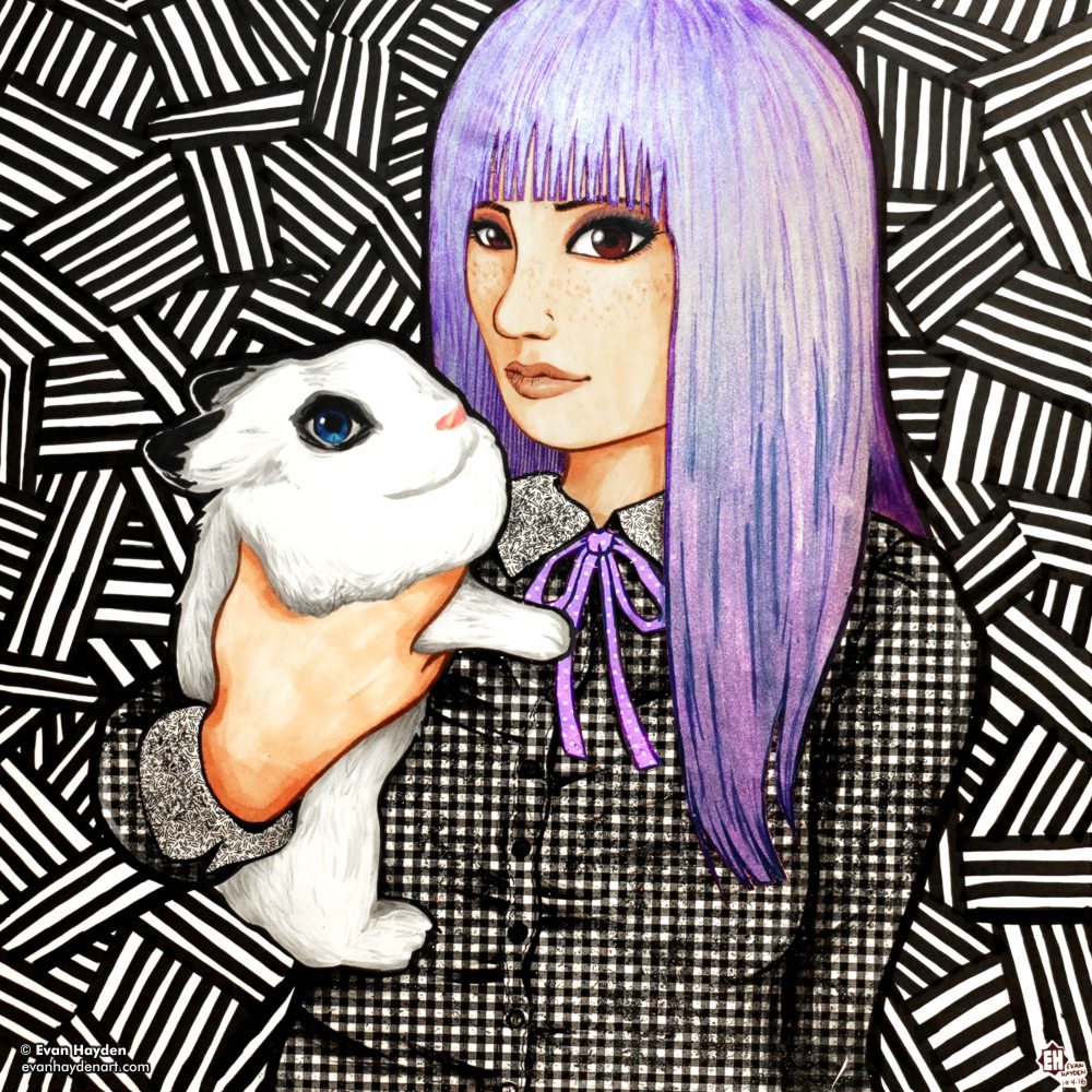
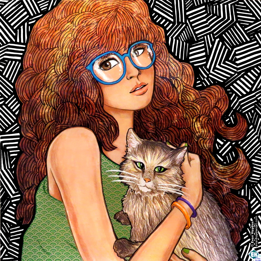
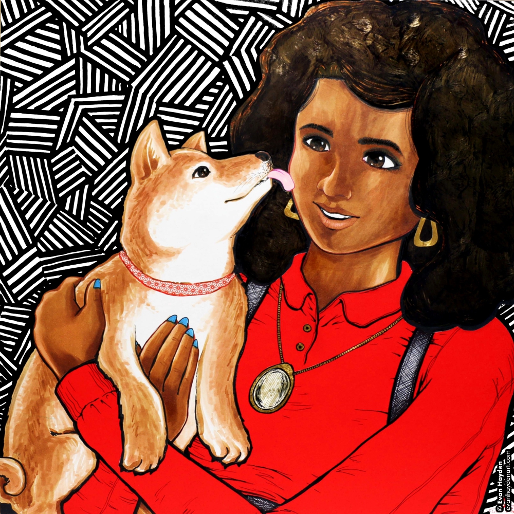
After a long time of being too busy to work on personal art (still sort of am), I made a sequel to last year’s “Her Best Friend“, and this one features a pretty lady with a cute shiba inu! Like the last one, this was done on a big shikishi board, with Copic markers and metallic washi paper (the hair). The red is a really vivid washi paper with lovely texture that looks great IRL. I may do another one or two illustrations in this series.


In other news, I apologize for the long time since last post. I’ve been super duper busy with the day job + manga lettering, and now…. getting ready to move home! Yep, after three years in Nagasaki, I’m leaving Japan to go back to the states. Couple reasons… the reason that’s been pressing at me for a long while is that I need to help my parents clean up and move out of the house I grew up in so they can get their finances in order and so we can all sort through our respective collections of stuff. I was going to hang in there with my current teaching job in Japan until August ’16 and then move home to help out, but a very nice opportunity came up that I couldn’t pass up. As you may know,  I’ve been lettering manga for Kodansha Comics / Penguin Random House this past three years, and have built up a nice relationship with them and have worked on a bunch of fun books for them. For next year I had the opportunity to either take one one new books series (in addition to the ones I’ve been doing), and keep trying to balance that with the demands of my day job, or quit the day job and take four new series. Truthfully, it’s been exhausting this past year, doing a book per month in addition to day job, in addition to spending time with my girlfriend and pals, and getting sleep, and I enjoy doing the publishing work more these days than teaching, so it was time for a change. As of January, I’ll be back in Southeast Michigan, focusing on my manga lettering work (and cleaning the house, and going on Fallout 4 binges). The pay will be better and the workload lighter, on average. This is great as it’ll allow me more time to work on my own art in my spare time. I’m not 100% sure how long I’ll be back in Michigan, but it depends on how long the house takes to get ready, and how long I want to enjoy socking away extra money from living cheaply before I run myself through the ringer of living in a “hip” place again. Also, the plan is my girlfriend will stay with me there for three months in the spring (the longest she can stay in the states as a tourist), and we’ll decide what we want to do from there, in terms of staying together and where we might live. Anyway, I’ll be busy for the rest of the year and most of January, so I probably won’t be updating this blog for a while, but once I have my current two books done, have moved out of my apartment, and have tied up loose ends in Japan, I’ll be resettling back in my old home and will have many more updates for you. Exciting times!

Saturn

Saturn

I just finished up a fun new illustration, “Saturn“. This was a bit of an experiment for me, as I don’t often paint, and I just bought myself a nice watercolor set recently to try to have fun with. The original art was drawn in marker, then colored with watercolor, then I reapplied the outlines on the computer. I think it’s a fun result. Click on the pic, or here to see the full image and bonus making-of images!

VERSION 3.0

evanhaydenart.com version 3.0 is now live!

Hello world!


It’s finally done… After five years I finally gave my art site a complete overhaul and it’s now online. This is my biggest site redesign yet, and I started over from scratch. Here are some of the changes I made:


  • New aesthetic design. The theme could best be described as “rainbow”.  Each gallery section now has its own unique color scheme, for example purple for Illustrated-photography, blue for Photography, and so on. If you’ve been visiting my site for a long time, the background may seem familiar. I always liked the random jaggy thin-line pattern background of the old pre-evanhaydenart.com days, so I brought it back, but in this case, it’s a different color in each gallery. Also making a return is one of my favorite typefaces, Herb Lubalin’s “Avant-Garde”, making up the navigation section lettering. It’s a more sedate usage of the typeface than he did, but I think it works fairly elegantly for the nav boxes. Speaking of typefaces, I stopped using Lubalin Graph (Another Lubalin classic. He was an amazing designer!) since I used it to death on version 2.0’s design. I’ll still use it on blog post promo images, because it is my favorite typeface, but for the main site, I went with something a little more familiar… Georgia! Yep, everyone has this font, and maybe it could seem boring, but I like it a lot, so hey… In other news related to the new design,  all the thumbnail images and text is a little bigger now, to account for larger monitor sizes and resolutions, and to make for easier viewing on mobile devices. Also, the page headers still show a different image upon each page load, but now they’re color-matched to the rest of the page. So many different files were made for that…
  • Flashier index page(s). Speaking of rotating images, the new index splash page is definitely splashy! A new background loads upon each visit to the page, and fills the screen. I’m sort of picky about the new trend of GIANT leader images for articles and whatnot, but I think for a gallery front page it’s fine. I also tried to make this page work a little better on mobile devices.
  • New, wider layout. I ditched the two-column design for a single-column design, allowing me to use bigger images (seems fitting for an art gallery site, right?) The navigation is now at the top of the page, under the header.
  • Big big big! About those big images, I apologize for anyone on slow internet connections, but I decided to go all-out this time… Each gallery page has big 1000px wide images for the artwork, and in the case of some pages where the art is a series of pictures, several of those big images. I feel that for an art portfolio site, big splashy images is good, and enough people have high-speed internet these days that I feel pretty comfortable designing for that now. It might be a headache on mobile networks if you’re at 3G or below, and I know that’s where a lot of people view the internet these days, but I firmly believe an art site is best viewed on a decent sized monitor.
  • Mobile-ish. On the topic of mobile-internet, I haven’t yet figured out how to make a totally mobile-friendly site yet (I’m not a programmer, I just struggle my way through each redesign when I absolutely have to), but even though some of the images are pretty big now (which load just fine on 4G), the layout this time around is at least a bit better for mobile. There’s some text you need to expand to see better, but the site doesn’t totally fall apart when viewed on a cell phone like my old site did. If I had the time, I would make a separate version of the site just for mobile, and have the code redirect you there when you view it on a phone, but I’m way too busy with work right now to do that, so please hang in there until I can 🙂  This site took long enough as is to redesign (a couple hundred hours, easily) so I may have to wait until I can afford to hire a designer to make a more mobile-friendly version for me.
  • my Society6 storeOther changes… I reorganized the site. After seven years apart, the fashion / portrait photography and automotive photography pages have been consolidated back into a Photography page. Since I haven’t been doing many proper shoots of cars lately, that page seems a little flimsy to warrant its own separate gallery. Also, all the separate gallery archive pages have been consolidated into one Archive page. Another change now involves the bio, links, and store pages being consolidated into an About page. I added some stuff to that about page. The resume / biography is still there, as are links. I added a FAQ page, a Contact page, and a proper Store. The FAQ exists to try to handle some of the questions I get repeatedly over the years… the Contact page is pretty self-explanatory, and now doesn’t involve me having to divulge an email address (thanks Foxyform!)
  • Store! Finally! The store is the big addition… After, oh, seven years of promising I’d add a store to my site to make it easier to buy prints, I finally did, with Society6. Part of what caused the delay for so long was my 2008 hard drive failure, which caused me to lose a lot of original art. Once I rebuilt my portfolio and had some good stuff to sell, it was a combination of being busy and being honestly a bit intimidated by the whole thing. Society6 should be a good solution because I don’t have the time right now to print and send orders myself, and doing so from Japan is its own kind of headache. Society6 fulfills the orders for me, and they have a good quality to their work. So yeah, finally, if you want to order prints of my work, or other stuff (pillows, cell phone / ipad cases, laptop skins, leggings, duvet covers, shower curtains, etc!), please check out my store!
  • NSFW-avoidance, if you want it. I separated the NSFW / 18+ only artwork a bit more from the rest of the content. I don’t want to censor myself, but given the nature of my day job, teaching kids, I wanted to make it a little harder to stumble across stuff that might not be suitable for the office or for younger eyes. Now, when you go to certain galleries, such as Illustrated-photography, the subsection with nudity or violent images is clearly labeled as such, in English and Japanese, and separated from the other content. If you’re using the back / forward buttons to navigate from page to page, it will stop when it gets to the NSFW content, sending you back to the main gallery, and you’ll have to click the thumbnail of the NSFW stuff to see it. No passwords or any stupid stuff like that. I just wanted to keep things accessible to those who want to see it, but stuff harder to have an “oopsie” moment and see it when you weren’t expecting it.
  • I mentioned Japanese… One thing I was planning to add to the launch, but decided to wait on a little bit longer, is Japanese translations for a lot of the major content. I already did them, in my mangled Japanese, but I have a friend who’s helping to smooth them out, so I’ll add said translations soon. The site is still prominently English-language, but at least for the main gallery indexes, there will be Japanese as well. For the individual artwork pages, there will be just English, but those are more about the imagery anyway, and I type too much sometimes, so maybe I’m actually sparing my Japanese viewers a bit!
  • New blog. As mentioned in the last blog post, the Blog has been 100% redone. After I bungled things and lost my blog archive, I took the time to redo all the old entries based off of salvaged data from the Internet Archive (but lost the comments, sadly). I also added some “from the future!” content to some of those old entries, ie: photos from events that happened. The new blog works much better on mobile devices. Well, to be honest, I used some WordPress trickery to make the site load a separate version for viewing the blog on a cell phone, and it’s not super pretty, but at least it’s not broken. It’ll do for now, until I can figure out how to customize it to make it have a bit more in common, design-wise, with the desktop site. new art!
  • What else? I added a TON of new artwork to the site… The Illustration gallery now has a section dedicated to educational art, of which I’ve been making a lot at my day job. This section includes an in-depth look at the “Hello English Picture Dictionary”, which is a publication I designed, edited, and illustrated. Also featured are worksheets I’ve made art for, and the “Word-of-the-Week” whiteboard that I draw each week for my students. Go check all that out! The Photography gallery has a new “Etcetera” section now, with photos of cats, birds, urban wreckage, night photography, and other things! Also added to the Photography page is some of the photos I’ve shot over the years of mangled and neglected vehicles and more robot photos! Growing up in the rust belt made for many such opportunities. I added new art to the Illustrated-photography gallery – an ink one, my first such piece like that in eight years. It’s of my lovely girlfriend Miwa. Finally, I added some new stuff to the Design gallery, including more mix CDs with custom packaging, more flyers, and a more depth look at my manga lettering.
  • B-B-B-BONUS. One thing you’ll notice on many of the artwork pages, is a lot more bonus content. More details, more behind-the-scenes, more more more! Also for each artwork that is available to buy on Society6, it’s linked within the page, and for manga and zines, there are links to buy the books from their respective publishers.


Okay, I think that about sums it up! Jeez, sorry to type a novel here, but this is the biggest update ever to my art site and there was a lot to cover! I’ll have more art coming soon, so stay tuned!

Her Best Buddy

Her Best Buddy

Another fun image made with fancy Japanese washi paper on a big shikishi board. I made this last October, to show at the culture festival day at one of the junior high schools I teach at in Nagasaki, and am getting it posted now. The kitty is none other than my kitty, Magnus!  Sadly, a couple months after I made this, my beloved kitty passed on from a kidney problem, so this illustration has taken on extra significance for me. Rest in peace, my little buddy
Anyway, if you’d like to see a bigger view of the image, as well as details & the making-of, click here! Also, you can download a big wallpaper for your monitor there 🙂

Goldie

Goldie

I made a big, pretty new illustration (that’s also nsfw because of bewbz), called “Goldie“.  This piece was a fun new direction for me. While shopping at my favorite art supply store in Nagasaki, I saw a couple pieces of washi paper that instantly inspired me. One was metallic gold and full of swirls. This reminded me of curly blonde hair. There was also a piece of white paper with golden speckles (and a few silver speckles here & there), that reminded me of freckles. Using these, as well as silver washi paper for the background and metallic green origami paper for her eyes, I set about making an image of the pretty lady you see here. I worked larger than usual, and it was pretty fun to get out of my usual comfort zones. Since it’s too big to scan, I took photos, so hopefully the one you see above looks okay. It’s about the closest I could get. Since there’s metallic stuff everywhere, it’s very hard to photograph. I’ll be working with washi paper more in the near future as I really love the look. I just bought several new sheets of crazy patterns and am excited to get to work!


Anyway, if you’d like to see the full image, as well as details, the making-of, click here! Also, you can download a big wallpaper for your monitor there 🙂