 Hey dudes and dudettes.. Yes, it has been a long time since my last post. This summer was pretty crazy busy, and fall got busier. Since my last post, I moved to Los Angeles in early October. I’m here possibly temporarily, hopefully long term. It just depends on how my job hunt turns out. I’ve also been applying for things up in the Bay Area, so I could end up back there. Or I could end up back in Michigan again if I don’t get something stable set up here by the time I run out of money. Maybe I shouldn’t be so forthcoming about that stuff on my art blog – perhaps it makes me look unprofessional – but hey, just being honest. It’s a rough economy out there for everyone, and a time when there are a lot less opportunities for us creative professionals. Let’s just say that for every graphic design or photography job I’ve applied to, I’ve applied to two retail jobs. Desperate times call for desperate measures. I’m just hoping to get something stable enough out here to stay, and keep working towards… THE PRIZE.
Anyway, despite not getting much real art done this last four months, I have been making some stuff. The problem is that a lot of it is freelance graphic design for secret projects, or for internal corporate documents & presentations. Not as exciting as making big colorful illustrated-photo pieces, or comics, or fashion photography, but it does pay the bills when those fun things are hard to rely on in an economic pinch. Anyway, I should be able to show some of that work sooner or later…
I did actually make quite a bit of changes to the site, both in flow and mechanics. A lot of it you won’t really see, but trust me, it helps. I guess you could say it’s evanhaydenart.com, ver 2.1. Since coding is not second nature to me, I had some big bugs that had been waiting to be squashed since the site overhaul. The last bit of them involved problems with the CSS involved in my links. So if you saw visited links showing up as white on white (not very user friendly), that’s why. Usually it’s as simple as changing a style property, but this was a unusually complex problem, under the surface. I wanted to extend my gratitude to my buddy Vivian Hui – an amazing graphic designer and web designer – for helping me fix this problem!
Other changes around the site include:
- New background on all pages but the intro page. I love the way the colorful pink & purple splash background looks on the intro page, but on the regular gallery pages, I thought things were looking a bit too busy, and that the background distracted from the content. The new background is darker, which should help the content stand out more, and still has that eye-trickery that I like… If you stare at it too long, it starts to get a bit of a moiré pattern to it… I apologize for any headaches it may induce!
- Shuffled around some of the Illustrated-Photography and People Photography pieces. Deleted some of the old stuff, and took some of the old or less-potent stuff and moved it into archive pages. Basically these archive pages have work that I’m still fond of in a way, and want you to be able to see if you so desire, but don’t have the same punch as the newer and/or better work that I wish to showcase. If you want to see the archives, they are linked on the bottom of their respective galleries.
- Simplified code throughout the site. Many of the pages should load faster and cleaner now. There was a lot of redundant/junk code that Vivian pointed out, and I tried to strip away a bunch of it. Also, since the new background is about 10% the file size of the old one, that should load faster as well.
- Rearranged the links page a bit for better visual parsing.
- Took the links to all my different automotive Flickr sets out of the Automotive Photography page. You can still access them, but I realized that I didn’t need them all listed there. Took up a lot of space, and was too much to maintain every time I made a new Flickr set (which I do often). So now just click to check out the collection, and go from there…
As for things still on my checklist, I realize it’s been two years since the new site launched, and I still don’t have a proper shop set up for prints. I’ll get to that soon, hopefully, if my life stabilizes anytime in the near future. What originally held me back was when my hard drive died in ‘08, and I lost the originals of a lot of my work. I had to redraw a lot of them to sell any prints, and I now feel that those redrawn ones, in addition to my new work since, has given me a good base to work from, when I do get the store set up. In the meantime, just email me (skeletron AT gmail DOT com) if you wanna buy some thangz. Also, I know that the music page is pretty barren. I’m still on a music hiatus. I want to get back into it soon, but again, life has been too hectic, busy, and unstable this last couple years.
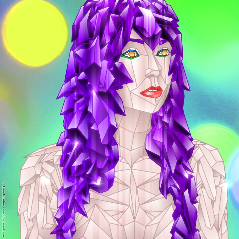
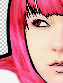
In other, more exciting news, see that pretty face up there? The one with a few outlines, but still none of the nose? That is a very tiny segment of my next illustrated-photo piece. It’s going to be a very epic one. I’m about 4 hours into it, and I estimate it’ll take another 40 to finish. It will contain a lot of different themes that I enjoy, all jammed into one big piece. As for those themes, I’ll keep them secret for now… I will just say that it’s my first illustrated-photo to contain an explosion! Also, the theme could be referred to as “a love letter to my 13-year-old self”. I’ll keep that vague for now. It’ll all make sense when it’s done. Anyway, adieu for now. Hopefully less than four months will have elapsed by the next time I write.