catching up with the Deathscape Navigator

Deathscape Navigator

Added some recent album packaging designs, one from this past summer and one from last year (belatedly). Above, you’ll see the cover and back cover of my album “Deathscape Navigator”. Click above, or here, to see the rest of the packaging art! Below, you’ll see the cover and back cover for the mix CD set I made for Ryan last summer. Click below, or here, to see the rest of that compilation’s art!


Catching Up...

Party on!

“Silence is Golden” – revisited

Silence is Golden - new art

Recently, I made a box set of my music for my friend Ethan, before he moved to Tokyo. For each of the six included albums, I redesigned the packaging and added some new art.I’ll make a post about more of that later, but to start, I wanted to share with you the two new illustrated photography pieces I made this summer for “Silence is Golden”, my 2006 LP. In addition to the original cover and back cover, I used two more photos from my shoot with Dawon to make an inner sleeve to hold the disc, one of which is a track listing. It was fun to revisit this photo shoot and make something new from it. Check out bigger views of this art in the Illustrated Photography section and see the packaging design in the Design section!

Barefoot Gen cover designs

Barefoot Gen cover designs

Last year I had the great honor of redesigning the outer sleeves for Last Gasp’s 2016 Kickstarter campaign edition of Keiji Nakazawa’s “Barefoot Gen”. The first four volumes were released in hardcover form to backers, and donated to libraries and schools. Over time, the softcover versions of all ten volumes will be replaced by new editions with my designs. Click here or the above preview to see the sleeves larger and in detail.


For these covers, I scanned-in many interesting and emotional panels from my copies of the 1985 run of the Japanese edition. My books are old and weathered, and I decided to retain that for the images in my final design(hence the back cover of volume 3 having some damage, for example.) For the logo, I made that in sumi ink with a large brush.


I’m very proud of these designs, and very much enjoyed seeing the hardcovers in print, and am looking forward to seeing the softcover editions when they are in print. Barefoot Gen is an extremely important and historic work of art, and I’m happy I got to take part in its new print run.

Lots of manga lettering!

Lots of manga lettering!

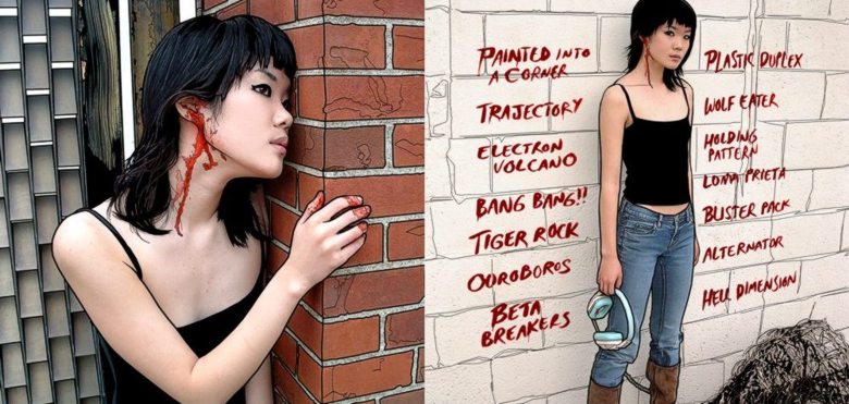
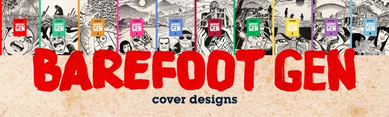
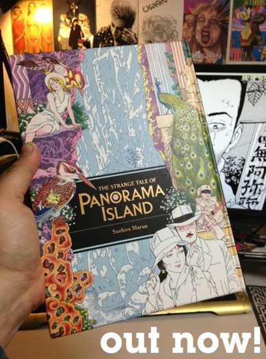
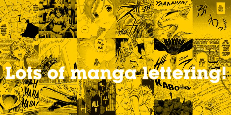
Hey everyone! A couple years ago, I added examples of my manga lettering work to the site. Since then, I’ve done a lot more books (I’ve lettered 60 manga volumes to date!), but never really had the time to show examples of that newer stuff here. Well, I just posted a TON of samples of my lettering work, showcasing a wide range of techniques. You can see the extremely complex and challenging lettering tasks I’ve taken on on Real Account, the large amount of hand-written work I’ve done on Forget Me Not, the all-by-hand lettering I do on Land of the Lustrous, the crazy action-packed sound effects of Ninja Slayer Kills, and other fun stuff! Also, check out the work I’ve done on dream-come-true projects such as Akira (for the upcoming 35th anniversary box set), Die Wergelder, and The Osamu Tezuka Story. I’m still in disbelief that I got to work on Akira. I’ve been a big fanboy for that series since I was 13 years old! Also, feel free to take a look at some of the pages for manga that I’d previously posted here, such as Sankarea and Maria: The Virgin Witch, since I overhauled the pages and added new examples. I think in general, the stuff I chose to share gives a good example of my range as a letterer, and I’m excited to finally have something convenient to show to family and friends who are curious what I do. Oh and btw, I went out of my way to avoid using images that are spoilers, so if you’re a manga fan, don’t worry about having stories ruined for you when looking. While you’re checking out the samples, feel free to follow the links on each page to buy the books from their respective publishers! More manga selling means dinner on my table.


Anyway, you may notice that I’ve changed the location of my manga lettering pages from the Design gallery, to the Comics gallery. Even though I do plenty of design work as part of my manga job, as a whole it seemed like it would fit in better in the Comics gallery, not to mention adding a little life to that page (since I never seem to have time to make my own comics.) Go ahead and check out the Comics gallery to see everything, but if you want a handy little list of all the titles reflected there, here you go!:


Akira  |  Barbara  |  Cat Diary: Yon & Mu  |  Complex Age  |  Die Wergelder  |  Forget Me Not
The Ghost and the Lady  |  Land of the Lustrous  |  Livingstone  |  Maria: The Virgin Witch
Ninja Slayer Kills  |  The Osamu Tezuka Story  |  Panorama Island  |  Real Account
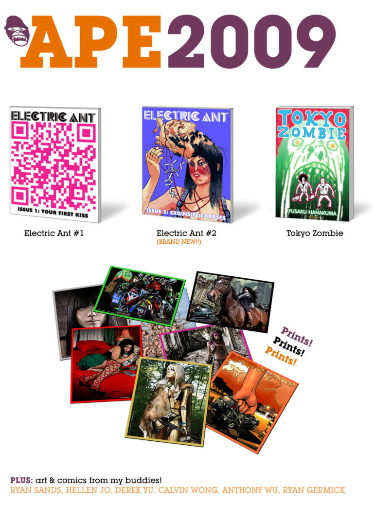
Sankarea  |  That Time I Got Reincarnated as a Slime  |  Tokyo Zombie


PS: I also relettered a volume of Battle Angel Alita: Last Order a couple of years ago (another dream title, seeing as the original Battle Angel Alita is what introduced me to manga in the first place), but since I just handled dialog balloons, I figured there wasn’t too much to show of that.


What else is new? Since last I typed here, I had a crazy busy month of work, then a lot of preparation for my wedding, then the big day itself, then showing my parents around Japan for a couple weeks during their first visit here, then a couple weeks of recharging my batteries, then more work. I’m in a brief time of respite at the moment, then back to more work soon. I have another post ready to share with you soon, however, about another neat comic-related thing I worked on. Stay tuned!

VERSION 3.0

evanhaydenart.com version 3.0 is now live!

Hello world!


It’s finally done… After five years I finally gave my art site a complete overhaul and it’s now online. This is my biggest site redesign yet, and I started over from scratch. Here are some of the changes I made:


  • New aesthetic design. The theme could best be described as “rainbow”.  Each gallery section now has its own unique color scheme, for example purple for Illustrated-photography, blue for Photography, and so on. If you’ve been visiting my site for a long time, the background may seem familiar. I always liked the random jaggy thin-line pattern background of the old pre-evanhaydenart.com days, so I brought it back, but in this case, it’s a different color in each gallery. Also making a return is one of my favorite typefaces, Herb Lubalin’s “Avant-Garde”, making up the navigation section lettering. It’s a more sedate usage of the typeface than he did, but I think it works fairly elegantly for the nav boxes. Speaking of typefaces, I stopped using Lubalin Graph (Another Lubalin classic. He was an amazing designer!) since I used it to death on version 2.0’s design. I’ll still use it on blog post promo images, because it is my favorite typeface, but for the main site, I went with something a little more familiar… Georgia! Yep, everyone has this font, and maybe it could seem boring, but I like it a lot, so hey… In other news related to the new design,  all the thumbnail images and text is a little bigger now, to account for larger monitor sizes and resolutions, and to make for easier viewing on mobile devices. Also, the page headers still show a different image upon each page load, but now they’re color-matched to the rest of the page. So many different files were made for that…
  • Flashier index page(s). Speaking of rotating images, the new index splash page is definitely splashy! A new background loads upon each visit to the page, and fills the screen. I’m sort of picky about the new trend of GIANT leader images for articles and whatnot, but I think for a gallery front page it’s fine. I also tried to make this page work a little better on mobile devices.
  • New, wider layout. I ditched the two-column design for a single-column design, allowing me to use bigger images (seems fitting for an art gallery site, right?) The navigation is now at the top of the page, under the header.
  • Big big big! About those big images, I apologize for anyone on slow internet connections, but I decided to go all-out this time… Each gallery page has big 1000px wide images for the artwork, and in the case of some pages where the art is a series of pictures, several of those big images. I feel that for an art portfolio site, big splashy images is good, and enough people have high-speed internet these days that I feel pretty comfortable designing for that now. It might be a headache on mobile networks if you’re at 3G or below, and I know that’s where a lot of people view the internet these days, but I firmly believe an art site is best viewed on a decent sized monitor.
  • Mobile-ish. On the topic of mobile-internet, I haven’t yet figured out how to make a totally mobile-friendly site yet (I’m not a programmer, I just struggle my way through each redesign when I absolutely have to), but even though some of the images are pretty big now (which load just fine on 4G), the layout this time around is at least a bit better for mobile. There’s some text you need to expand to see better, but the site doesn’t totally fall apart when viewed on a cell phone like my old site did. If I had the time, I would make a separate version of the site just for mobile, and have the code redirect you there when you view it on a phone, but I’m way too busy with work right now to do that, so please hang in there until I can 🙂  This site took long enough as is to redesign (a couple hundred hours, easily) so I may have to wait until I can afford to hire a designer to make a more mobile-friendly version for me.
  • my Society6 storeOther changes… I reorganized the site. After seven years apart, the fashion / portrait photography and automotive photography pages have been consolidated back into a Photography page. Since I haven’t been doing many proper shoots of cars lately, that page seems a little flimsy to warrant its own separate gallery. Also, all the separate gallery archive pages have been consolidated into one Archive page. Another change now involves the bio, links, and store pages being consolidated into an About page. I added some stuff to that about page. The resume / biography is still there, as are links. I added a FAQ page, a Contact page, and a proper Store. The FAQ exists to try to handle some of the questions I get repeatedly over the years… the Contact page is pretty self-explanatory, and now doesn’t involve me having to divulge an email address (thanks Foxyform!)
  • Store! Finally! The store is the big addition… After, oh, seven years of promising I’d add a store to my site to make it easier to buy prints, I finally did, with Society6. Part of what caused the delay for so long was my 2008 hard drive failure, which caused me to lose a lot of original art. Once I rebuilt my portfolio and had some good stuff to sell, it was a combination of being busy and being honestly a bit intimidated by the whole thing. Society6 should be a good solution because I don’t have the time right now to print and send orders myself, and doing so from Japan is its own kind of headache. Society6 fulfills the orders for me, and they have a good quality to their work. So yeah, finally, if you want to order prints of my work, or other stuff (pillows, cell phone / ipad cases, laptop skins, leggings, duvet covers, shower curtains, etc!), please check out my store!
  • NSFW-avoidance, if you want it. I separated the NSFW / 18+ only artwork a bit more from the rest of the content. I don’t want to censor myself, but given the nature of my day job, teaching kids, I wanted to make it a little harder to stumble across stuff that might not be suitable for the office or for younger eyes. Now, when you go to certain galleries, such as Illustrated-photography, the subsection with nudity or violent images is clearly labeled as such, in English and Japanese, and separated from the other content. If you’re using the back / forward buttons to navigate from page to page, it will stop when it gets to the NSFW content, sending you back to the main gallery, and you’ll have to click the thumbnail of the NSFW stuff to see it. No passwords or any stupid stuff like that. I just wanted to keep things accessible to those who want to see it, but stuff harder to have an “oopsie” moment and see it when you weren’t expecting it.
  • I mentioned Japanese… One thing I was planning to add to the launch, but decided to wait on a little bit longer, is Japanese translations for a lot of the major content. I already did them, in my mangled Japanese, but I have a friend who’s helping to smooth them out, so I’ll add said translations soon. The site is still prominently English-language, but at least for the main gallery indexes, there will be Japanese as well. For the individual artwork pages, there will be just English, but those are more about the imagery anyway, and I type too much sometimes, so maybe I’m actually sparing my Japanese viewers a bit!
  • New blog. As mentioned in the last blog post, the Blog has been 100% redone. After I bungled things and lost my blog archive, I took the time to redo all the old entries based off of salvaged data from the Internet Archive (but lost the comments, sadly). I also added some “from the future!” content to some of those old entries, ie: photos from events that happened. The new blog works much better on mobile devices. Well, to be honest, I used some WordPress trickery to make the site load a separate version for viewing the blog on a cell phone, and it’s not super pretty, but at least it’s not broken. It’ll do for now, until I can figure out how to customize it to make it have a bit more in common, design-wise, with the desktop site. new art!
  • What else? I added a TON of new artwork to the site… The Illustration gallery now has a section dedicated to educational art, of which I’ve been making a lot at my day job. This section includes an in-depth look at the “Hello English Picture Dictionary”, which is a publication I designed, edited, and illustrated. Also featured are worksheets I’ve made art for, and the “Word-of-the-Week” whiteboard that I draw each week for my students. Go check all that out! The Photography gallery has a new “Etcetera” section now, with photos of cats, birds, urban wreckage, night photography, and other things! Also added to the Photography page is some of the photos I’ve shot over the years of mangled and neglected vehicles and more robot photos! Growing up in the rust belt made for many such opportunities. I added new art to the Illustrated-photography gallery – an ink one, my first such piece like that in eight years. It’s of my lovely girlfriend Miwa. Finally, I added some new stuff to the Design gallery, including more mix CDs with custom packaging, more flyers, and a more depth look at my manga lettering.
  • B-B-B-BONUS. One thing you’ll notice on many of the artwork pages, is a lot more bonus content. More details, more behind-the-scenes, more more more! Also for each artwork that is available to buy on Society6, it’s linked within the page, and for manga and zines, there are links to buy the books from their respective publishers.


Okay, I think that about sums it up! Jeez, sorry to type a novel here, but this is the biggest update ever to my art site and there was a lot to cover! I’ll have more art coming soon, so stay tuned!

Panorama Island – out now!

Panorama IslandIn other news, “Panorama Island”, a manga that Ryan Sands and I adapted into English is now available! It’s being put out by Last Gasp, and is now available to purchase in lots of different places, such as directly from Last Gasp, or via Amazon, for example. It was a dream project to work on, since it’s a Maruo comic, based off of an Edogawa Ranpo story. The book came out beautifully, and is a nice big hardcover. Here’s what Amazon has to say about the story.
On a remote and mysterious island, one man builds a playground of hedonistic excess – replete with waterfalls, grand palaces, and gardens – a backdrop for his decadent feasts, orgies, and dark secrets. Set in 1920s Japan, The Strange Tale of Panorama Island follows the twisted path of failed novelist Hitomi, who bears an uncanny resemblance to the son of a rich industrialist family. Hitomi learns of the rich man’s sudden passing and creates a desperate plan. He fakes his own death, digs up and hides the other man’s body, and then washes himself up starving on a beach near the home of the dead man’s family. After successfully impersonating the now-dead son, Hitomi takes over all aspects of the industrialist’s life, including his company, his fortune, and eventually his wife. The failed author soon redirects the family’s wealth to his own perverse aims. A graphic novel based on the revered novella by Edogawa Rampo. Rampo was the godfather of Japanese pulp mysteries. Stunning artwork by master manga artist Suehiro Maruo deftly illustrates this Japanese pulp classic in fine detail. * 13th Tezuka Osamu Cultural Prize for New Artist


I handled the lettering, touch-up, and book design, while Ryan handled the editing. Ryan and Kyoko Nitta did translation. Pick up a copy and enjoy it 🙂

Odds & Ends – November 2011 edition

odds & ends...

Okay, in less naked news, I added a bunch of… well, odds & ends to the site, mostly to the Design page, but one to Illustration as well. Mostly stuff from the past year that I for some reason forgot to upload, but also a few brand new things.


In other news, I made a bunch of subtle tweaks all over the site. Now all the copyright dates are correct. Well, let’s rephrase that. I get lazy about going through the whole site each year and changing all the dates, and I’m not enough of a coding wizard to install a site-wide auto-updating line of date code. Thus, now it just says “© Evan Hayden” instead of  “© YEAR Evan Hayden”. It’s my copyrighted work, regardless of the year anyway. I can see you falling asleep from here, so I’ll get onto the other site tweaks… I also redid some of the thumbnails on the Design page to better reflect their content, mostly notably in the album packaging (square thumbnails now to give a quick preview of the whole album cover), and in the logos (thin borders on the thumbnail boxes now to make everything more cohesive). The other change I made was in taking most of the text on the screen and bumping it up a size. In my opinion, this isn’t as pretty as delicate small text on the page, but it’s more readable in general, and I was getting tired of leaning so close to my monitor to read my own dang site! (and others mentioned to me that the old font was too small as well). So in general these tweaks mean better accessibility for others, and less updating headaches for me!

VERSION 2.0

version 2.0!

*whew!*


I’m finally done with the revamp of evanhaydenart.com. As I mentioned, there may be some bugs here and there. If you spot anything, please let me know. Here’s what I’ve changed…


  • Design and layout. Fancier looking now, more colorful, and with darker accents. If you get nostalgic for the old look, you can take a peek at it here.
  • Added the Music page. Not much on it yet, as I’m just getting back into making music after a long hiatus.
  • Simplified some of the pages.
  • Moved the blog here, and replaced the main index page with a fancy landing page.
  • Made things load better on mobile devices
  • Fixed a lot of the problems with how things load on Safari & IE.


I also added several new (and a couple older) bits & pieces to the gallery pages… To the Illustration gallery, I added “Ting Terng” (something I did for the “covers” art jam on the Electric Ant blog), “Happy Birthday” (an illustration for a friend-of-a-friend’s birthday), and “Blind Beast” (A piece I did for Electric Ant issue 2. NSFW!). To the Design gallery, I added some examples of my graphic design and layout for Electric Ant issue 2, and from the vaults, I added “The World of Same Hat!” (the cover to a sampler of Same Hat!, a blog I cofounded with my best friend Ryan.) Yay!


Known bugs:

  • For some reason on all pages except the blog, if you hit ctrl+click (for example to open a link in a new tab), or hit right-click on the mouse, the page will redirect you to the index landing page. This is an annoying bug, and I’m hoping one of my more seasoned programmer friends can help me fix it. *hint hint*. For now, just hit back in the browser if it does that to you. I’m hoping to fix this asap.
  • On a smaller note, I need to tweak the way the outline formatting is on the thumbnails on the gallery index pages. I’m very sleepy now, but I’ll try to get that cleaned up in the next couple days.


Special thanks to Ryan, Melinda, Dawon, and Jason for helping me to test the design on a variety of resolutions, operating systems, and browsers! Anyway, enjoy the new site! I have a couple new illustrated-photo works coming in the next couple weeks, so look forward to that 🙂


come to APE!!

Hey kiddos, it’s that time again! Alternative Press Expo is almost upon us, and you should come and visit my table! I will be there with my buddies Ryan Sands, Hellen Jo, Derek Yu, Calvin Wong, Anthony Wu, and Ryan Germick, and we will be selling all kinds of comics, zines, prints, and other goodies. Keep reading for info…


APE 2009

INFO…
Saturday October 17th, 11am-7pm  &  Sunday October 18th, 11am-6pm
at The Concourse (620 7th Street, San Francisco CAView Map


Here’s a map of where we’re gonna be in the building (we’re called “Bang Gang”, and are at table #418)


APE MAP 2009


This will be the debut of issue 2 of “Electric Ant” – the comics & literary anthology zine that I do with Ryan Sands. Several of the contributors in the book will be at the show, so be sure to come. Come on by, say hi, and buy some shit!!!


EDIT (from the fuuuuuture!): Click this photo of my buddies and I to see a ton of photos from APE 2009!

APE 2009