I’m on a roll right now, in terms of working on creative projects. A little over 24 hours ago, I posted my brand new illustrated-photography piece, and I just finished finished something that is both new and old at the same time.
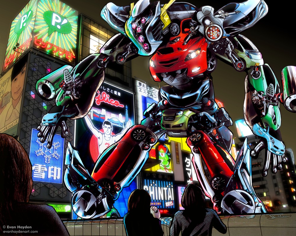
 In 2008, I made “Automaton JDM”, the image you see above. At the time, it was a personal milestone, in terms of detail, concept, and execution, and I think it blew my first Automaton piece (from 2006) out of the water. More recently, you’ve seen the third piece in the Automaton series, from last year, which is even crazier than the 2008 example. Anyway, back to 2008… After making “JDM”, as well as a couple other pieces around that time that I was quite proud of, my hard drive died and I lost the original hi-res / layered files, as well as a ton of other stuff. (PROTIP: Back your stuff up kids!) I was devastated at the time (it still stings a bit to think about), but I plugged on ahead with new work, and rebuilt / salvaged some of my older pieces. Lacking the digital files, I made high-res scans of prints that I’d previously made, redrew things, and tried my best to smooth out the colors and textures. On one particularly challenging salvage, I didn’t even have a print to scan, since I’d made the piece a few days before the crash. All I had was a tiny jpg, and an insanely difficult task of scaling it up to a decent print size, redrawing the whole thing from scratch, and doing a lot of damage control on horribly-enlarged pixels. Despite my best efforts, I was never fully happy with the results of some of these salvaged versions, as they always looked muddy and dark compared to the original digital files, but after the hard drive disaster, I didn’t have much that I could print out for art shows, so I had to make do.
Anyway, I was especially bothered by how much less vibrant Automaton JDM looked after salvaging, compared to its original form. All I had left of the original was a 750px wide jpg (which you’ll see top-right.) I salvaged that one in early 2009, but was never happy with the results. It was too dark and murky (see bottom-right.) It basically did the job for printing, but I felt a pang of guilt selling prints of it, as I knew it was not as good as it originally was, but there was certainly no way I could sell prints of a 750px wide jpg, unless I was going to go into the postage stamp business! (Actually, HMMM… new business venture?)
Since that first attempt, I happened to find a DVD with some of the layers of the original high-res 2008 file. Just the background, and the ladies in the foreground, but it was a start. Also, I’d purchased a better scanner since ‘09, and rescanned my original 8×10 print, getting much better results. Still not as smooth as the original file (it can’t be, given the dot-tone), but more subtle color shifts and shadows. Armed with this elements, I got to work last night making a second salvage attempt, and in the process, I decided to update / improve the piece as well, using newer techniques. Maybe it’s disingenuous to go back and do a “director’s cut” of old art, but I’ve done it before, on my comics, and I enjoy it. It’s like visiting an old friend and finding that they are doing better than ever!
The main improvements center around making the robot stand out better from the background. I simulated depth-of-field with the background, getting blurrier as it gets farther away. I also added a bit of a faint glow to the night sky, not just to make the robot stand out, but also because when you’re in a busy, electrified metropolis like Osaka, there’s a ton of light pollution in the sky. The other change I made to the background involves glow. I thought that the insanely bright neon signs of Dōtonbori were not properly represented by my original, so I added a subtle glow to the signs. I also tweaked the robot a bit to add more light reflection on its edges, to better fit it in with its brightly-lit background. The other change I made, was cropping things to make the piece as a whole fit better with my now standard dimensions. My old pieces were all over the map, which made framing a nightmare. Anyway, I think this new version is a success in that not only do I feel better about having an “Automaton JDM” that I can print without being slightly embarrassed, but I think this version’s better than the original one in multiple ways. I’ll probably do this with more of the pre-crash pieces that are in limbo, as well.
Anyway, I hope you enjoy seeing this old friend again, this time wearing a fancy new set of clothes 🙂